Visual Elements Aligned with Purpose and Presence
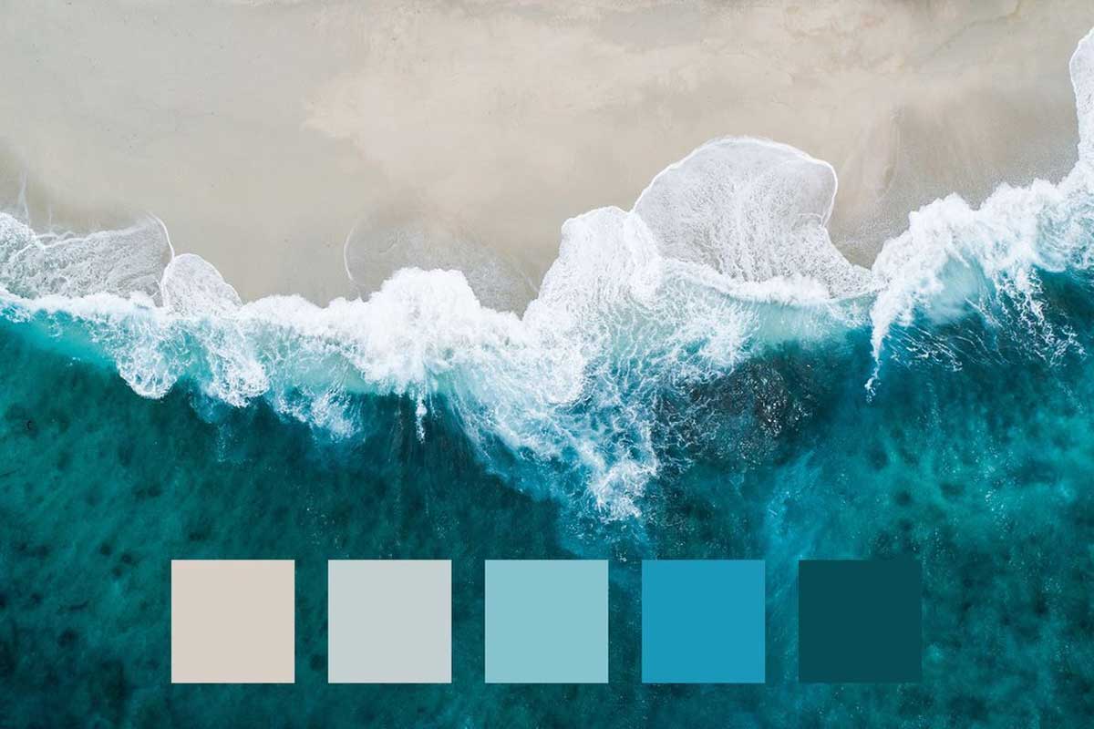
Color Palette
A thoughtfully curated colour palette is fundamental to how a brand is perceived, remembered, and emotionally experienced. Colour influences mood, recognition, and decision-making, shaping instant impressions long before words are read. When defined with intention, brand colours create clarity, consistency, and quiet confidence across every touchpoint.
A strong colour system ensures visual harmony across digital platforms, print, packaging, environments, and marketing communications. This consistency builds trust, reinforces credibility, and creates a cohesive brand experience that feels deliberate and refined. Over time, disciplined use of colour strengthens brand recall and distinguishes the brand within competitive markets.
At Unikon Infotech, we approach colour as a strategic asset, not a decorative choice. Our process explores brand essence, audience psychology, cultural context, and industry positioning to define colours that align with the brand’s identity and long-term vision. From primary palettes to secondary and functional colours, every shade serves a purpose.
To help brands establish a powerful visual foundation, our colour palette framework covers everything from understanding brand colour psychology to a step-by-step methodology for selecting, validating, and applying colours consistently. We also study successful global brands to draw insight and inspiration, ensuring each palette is both timeless and relevant.
The result is a colour system that enhances user experience, supports clear communication, and elevates the brand’s presence—transforming visual familiarity into lasting brand equity.
Colour Strategy & Brand Expression
The colour system defined for a brand plays a pivotal role across every marketing and communication asset—from logo design and business stationery to website interfaces, campaigns, packaging, and spatial branding. Colour is often the first element audiences register, making it a powerful tool for shaping perception and emotional connection.
When guided by the principles of colour theory, brand colours communicate meaning with precision. They influence mood, behaviour, and trust, allowing brands to speak intuitively to their audience without explanation. A well-considered colour strategy ensures that every visual expression reinforces the brand’s message, personality, and positioning.
Consistency in the application of brand colours across all platforms creates a unified visual language. This cohesion strengthens recognition, enhances memorability, and builds credibility over time. When colour usage is disciplined and intentional, it transforms individual touchpoints into a seamless brand experience.
Colour holds an immediate and universal power. From the yellow of a safety helmet to the purity of a bridal gown, colours convey information instantly, without words. This immediacy makes colour palettes a critical foundation of branding and graphic design—capable of guiding perception, setting expectations, and influencing experience within seconds.
At Unikon Infotech, we treat colour as a strategic asset rather than a stylistic choice. Our approach blends psychology, industry context, cultural relevance, and brand intent to develop colour systems that are timeless, functional, and distinct. The result is a refined visual identity that resonates, endures, and elevates the brand across every medium.
What Are Brand Colours?
Brand colours form a carefully curated palette—typically comprising five to ten distinct hues—designed to visually represent a brand’s identity, character, and positioning. More than decorative elements, these colours function as strategic identifiers that shape recognition, perception, and emotional connection over time.
When applied with consistency and intent, brand colours significantly enhance brand awareness and memorability. They allow audiences to recognise a brand instantly, often without the need for words, creating familiarity and trust across every point of interaction.
Brand colours are expressed across a wide range of touchpoints, including logo design, website colour systems, digital platforms, social media presence, business stationery, print materials, and advertising campaigns. Each application reinforces a unified visual language, ensuring the brand appears composed, credible, and cohesive.
For brands with physical environments, colour extends beyond screens and print. It influences retail spaces, signage, interiors, staff uniforms, packaging, and experiential design—transforming spaces into immersive brand expressions. This continuity between digital and physical environments strengthens brand recall and elevates the overall experience.
At Unikon Infotech, brand colours are developed as part of a larger visual system—grounded in strategy, psychology, and cultural relevance. Our approach ensures every colour choice supports long-term brand equity, delivering a refined, recognisable, and enduring identity across all platforms.
What Is a Brand Colour Palette?
A brand colour palette is a precisely defined selection of colours that form the foundation of a company’s visual identity. It establishes how a brand is seen, felt, and recognised across every medium, ensuring consistency and distinction at every point of interaction.
A refined brand palette typically includes primary colours, secondary colours, and accent colours—each serving a distinct role within the visual system. Together, they create a structured hierarchy that guides design decisions across logos, websites, packaging, marketing materials, and digital platforms.
When applied consistently, a brand colour palette builds instant recognition and emotional familiarity. It ensures visual cohesion across all brand expressions, allowing audiences to intuitively associate colours with the brand’s presence, values, and positioning—often before a single word is read.
Colour carries meaning. Blue often conveys trust and credibility, red expresses energy and confidence, while green suggests balance and growth. A well-designed palette leverages colour psychology to communicate brand intent subtly yet powerfully, influencing perception and experience without overt messaging.
At Unikon Infotech, we design brand colour palettes as strategic systems, not aesthetic choices. Each palette is developed through research, psychology, and cultural relevance, ensuring long-term consistency, memorability, and clarity—helping brands stand out while remaining timeless across all platforms and materials.
How to Define Your Brand Colour Palette in 6 Refined Steps
1. Articulate the Brand’s Essence
The colours chosen for a brand are a direct expression of its identity. A refined colour palette must align seamlessly with the brand’s values, voice, and narrative—reinforcing the story the brand intends to tell at every interaction. When colour and identity are in harmony, visual expression becomes both intentional and recognisable.
Defining this alignment begins with a clear understanding of the brand itself. Before selecting colours, the brand’s character, positioning, and long-term vision must be articulated. One effective approach is to describe the brand as a person—identifying adjectives that capture its personality, temperament, and presence. This human perspective brings clarity to how the brand should feel, not just how it should look.
Understanding how the brand wishes to be perceived is essential. Consider what differentiates it within its market, the emotions it should evoke, and the qualities that set it apart from competitors. These insights form the foundation for colour decisions that are strategic rather than stylistic.
A defined spectrum of brand identity traits—such as confidence, refinement, innovation, warmth, or authority—helps distil the brand’s core essence. At Unikon Infotech, this clarity becomes the starting point for building a colour system that is authentic, enduring, and aligned with the brand’s true character across all platforms.
2. Understand the Language of Colour
Once a brand’s personality and positioning are clearly defined, the next step is to translate that essence into colour. This requires a deep understanding of colour theory and colour psychology—disciplines that explain how colours influence emotion, perception, behaviour, and decision-making at a subconscious level.
Colour meaning is never absolute. Interpretation is shaped by context, cultural references, and, most importantly, by how colours interact with one another. A deep green paired with gold communicates heritage and luxury, while the same green combined with yellow evokes freshness and organic vitality. It is the relationship between colours—not individual shades—that defines perception.
These interactions play a critical role in branding. Thoughtful colour combinations can establish authority, warmth, sophistication, or energy within moments. When composed with intention, colour systems guide emotional response and create an immediate, intuitive understanding of the brand’s character.
While interpretations may vary, industry-led colour trends provide valuable strategic direction. Certain colour families have become strongly associated with specific sectors due to their psychological impact and historical usage. Understanding these conventions allows brands to align with audience expectations while still creating distinction.
At Unikon Infotech, we analyse colour through a strategic lens—balancing psychology, cultural relevance, and industry context to craft colour systems that feel considered, expressive, and enduring across all brand touchpoints.
Fashion and Beauty Industry: Colour Strategy
In the fashion and beauty industry, colour is not merely a visual choice—it is a language of aspiration, emotion, and identity. Brands in this space rely heavily on refined aesthetics and emotional storytelling, using colour to evoke desire, elegance, confidence, and exclusivity. The right colour palette allows fashion and beauty brands to communicate their essence instantly, even before a product is experienced.
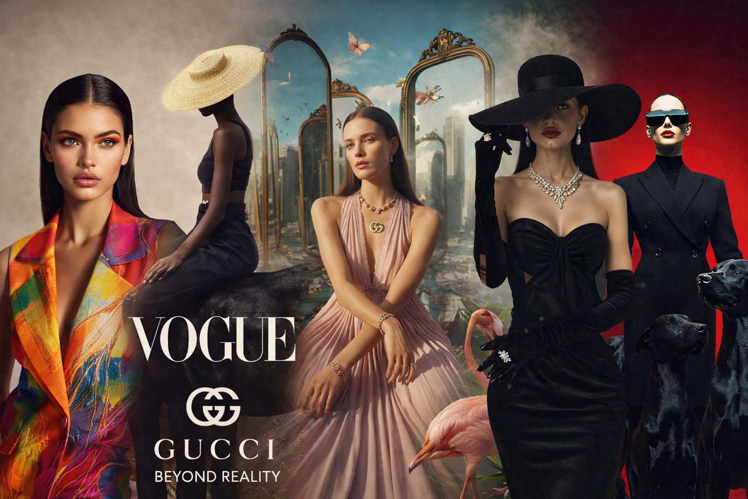
- Black is synonymous with luxury, authority, and timeless sophistication. It conveys confidence and power while creating a strong visual foundation for premium positioning. White, often used alongside black, represents purity, clarity, and minimal elegance, offering balance and refinement in brand expression.
- Red and deep burgundy tones introduce passion, intensity, and bold confidence. These colours are frequently used to signal strength, sensuality, and dramatic appeal, making them particularly effective for statement brands and high-impact campaigns. They command attention while reinforcing emotional depth.
- Pink and nude tones bring warmth, femininity, and personal expression into the visual identity. These shades communicate softness, approachability, and modern elegance, allowing brands to connect emotionally while maintaining a refined aesthetic.
- Gold and metallic accents elevate the palette further, symbolising premium quality, craftsmanship, and exclusivity. Used with restraint, metallic tones enhance perceived value and reinforce luxury without overwhelming the brand’s visual language.
- Together, these colour families help fashion and beauty brands establish a distinctive presence in a visually competitive market. When applied consistently across logos, packaging, digital platforms, and retail environments, they create a cohesive brand experience that is aspirational, recognisable, and enduring.
At Unikon Infotech, we curate colour systems for fashion and beauty brands with precision—balancing emotion, elegance, and strategic positioning to build identities that feel iconic, relevant, and timeless.
Hospitality Industry: Colour Strategy
In the hospitality industry, colour plays a vital role in shaping first impressions and lasting memories. Hotels, resorts, restaurants, and experiential spaces rely on colour to communicate comfort, trust, warmth, and refinement—elements that define exceptional guest experiences. A thoughtfully curated colour palette sets the emotional tone long before service is experienced.

- Blue is widely used within hospitality branding for its association with trust, reliability, and relaxation. From coastal resorts to business hotels, blue creates a sense of calm and reassurance, making guests feel at ease and well cared for.
- Green reflects balance, nature, and tranquillity. Often seen in wellness retreats, eco-resorts, and premium hospitality environments, green connects guests to a sense of restoration and harmony. It reinforces wellbeing while subtly signalling sustainability and mindful luxury.
- Warm neutral tones, such as beige, sand, and soft browns, establish comfort and familiarity. These colours create inviting spaces that feel grounded and welcoming, allowing guests to relax while experiencing understated elegance across interiors, branding, and digital touchpoints.
- Gold accents introduce a layer of sophistication and premium service. When applied with restraint, gold conveys exclusivity, craftsmanship, and elevated hospitality—enhancing perceived value without overwhelming the overall aesthetic.
- Orange and soft amber tones bring warmth, friendliness, and energy into hospitality environments. Used thoughtfully, these colours encourage social connection, enthusiasm, and approachability, particularly in dining and communal spaces.
Together, these colours help hospitality brands create immersive environments that foster emotional connection and brand recall. When applied consistently across visual identity, interiors, digital platforms, and guest communications, they transform service into experience.
At Unikon Infotech, we design hospitality colour systems that balance comfort with luxury—ensuring every shade contributes to a cohesive, memorable, and enduring brand presence across physical and digital spaces.
Real Estate Industry: Colour Strategy
In the real estate industry, colour serves as a visual signal of stability, trust, and long-term value. Whether addressing homebuyers, investors, or commercial stakeholders, real estate brands rely on colour to communicate confidence, professionalism, and enduring reliability. A refined colour palette reassures audiences that they are engaging with a brand built for permanence.

- Blue is a cornerstone of real estate branding, widely associated with trust, professionalism, and dependability. It conveys security and expertise, making it especially effective for developers, brokerage firms, and investment-focused brands seeking to inspire confidence in decision-making.
- Grey represents maturity, balance, and neutrality. Its understated presence adds sophistication while allowing architectural visuals and property imagery to take prominence. Grey is frequently used to create a composed and credible visual identity that appeals to both residential and commercial audiences.
- Green symbolises growth, prosperity, and sustainability—qualities increasingly valued in modern real estate. Often used by developers and property brands focused on long-term investment and environmentally conscious design, green reinforces optimism, renewal, and future value.
- Black introduces authority and refined sophistication. When used selectively, it elevates the brand’s presence, positioning it within the premium or luxury real estate segment while reinforcing strength and leadership.
- White brings transparency, clarity, and simplicity to real estate branding. It creates visual openness, supports trust, and enhances readability across digital and print applications, allowing the brand to appear honest, structured, and accessible.
Together, these colours create a visual language that reassures buyers and investors while reinforcing credibility and confidence. When applied consistently across logos, brochures, websites, signage, and on-site branding, they form a cohesive identity that reflects stability and long-term vision.
At Unikon Infotech, we design real estate colour systems with strategic intent—balancing authority, trust, and sophistication to build brand identities that stand strong across markets, cycles, and time.
Manufacturing Industry: Colour Strategy
In the manufacturing industry, colour is a signal of strength, precision, and operational discipline. Industrial brands rely on colour to communicate reliability, safety, efficiency, and technical expertise—values that are essential in environments where performance and trust are paramount. A well-defined colour palette reinforces engineering credibility and reinforces confidence at every level of engagement.

- Blue is widely used across manufacturing and engineering brands for its association with dependability, competence, and trust. It conveys technical mastery and stability, making it a foundational colour for companies operating in complex, performance-driven sectors.
- Grey and steel tones reflect durability, structure, and advanced technology. These colours mirror industrial materials and machinery, reinforcing a sense of strength and precision. Their neutral sophistication allows technical visuals, processes, and products to remain the focus while maintaining a professional aesthetic.
- Red introduces power, urgency, and decisive action. Used selectively, it highlights critical functions, movement, and performance, making it effective for controls, warnings, and emphasis within industrial branding and environments.
- Yellow plays a vital role in safety and visibility. Commonly associated with caution and awareness, yellow enhances legibility and supports compliance within industrial settings while reinforcing a brand’s commitment to operational safety.
- Black adds authority, control, and clarity. When integrated thoughtfully, it elevates industrial branding, conveying leadership, command, and confidence without compromising functionality.
Together, these colours form a robust visual system that communicates industrial reliability and operational excellence. When applied consistently across machinery, control panels, digital interfaces, documentation, and marketing materials, they create a cohesive and professional brand presence.
At Unikon Infotech, we design manufacturing colour systems with precision—balancing safety, performance, and brand authority to create identities that reflect engineering excellence and stand strong across global industrial markets.
Health & Wellness Industry: Colour Strategy
In the health and wellness industry, colour plays a vital role in shaping emotional comfort, trust, and long-term engagement. Wellness brands must communicate balance, purity, vitality, and reassurance—often before a single word is read. A refined colour palette helps create environments and digital experiences that feel calm, credible, and restorative.

Fashion and beauty brands rely heavily on emotional appeal, elegance, and aspiration.
Common brand colors:
- Green is the cornerstone of health and wellness branding. Closely associated with nature, healing, and growth, green symbolises renewal and balance. It reinforces a connection to natural processes, sustainability, and holistic care, making it ideal for wellness clinics, nutrition brands, fitness studios, and preventive healthcare services.
- Blue conveys cleanliness, calm, and trust. Widely used in medical and wellness environments, blue promotes a sense of reliability and emotional stability. It reassures audiences that they are in safe, professional hands while supporting clarity and mental ease.
- White represents purity, simplicity, and transparency. In wellness branding, white creates space—both visually and psychologically—allowing content, products, and services to breathe. It reinforces hygiene, clarity, and ethical practices while elevating the overall aesthetic with a modern, premium feel.
- Soft pastel tones, such as muted lavender, blush, sage, and sky blue, introduce peace and mindfulness. These gentle hues soften the brand experience, reduce visual stress, and support emotional wellbeing. They are particularly effective for yoga, meditation, mental health, and lifestyle wellness brands seeking a serene and nurturing identity.
- Orange, when used with restraint, adds warmth, energy, and positivity. It symbolises motivation and vitality, making it ideal for fitness, wellness coaching, and active lifestyle brands. Balanced carefully, orange injects optimism without overwhelming the calm foundation of a wellness palette.
Together, these colours form a harmonious visual language that promotes reassurance, emotional balance, and healthy living. When applied consistently across branding, packaging, interiors, digital platforms, and marketing communication, they create a cohesive wellness identity that feels intentional, trustworthy, and premium.
At Unikon Infotech, we craft health and wellness colour systems that blend science, psychology, and luxury aesthetics—ensuring your brand communicates care, credibility, and long-lasting impact across every touchpoint.
Agriculture Industry: Colour Strategy
Agricultural branding is rooted in nature, legacy, and responsibility. More than visual appeal, colour in the agriculture industry communicates trust, sustainability, and a deep respect for the land. A well-crafted agricultural colour palette reflects the rhythms of nature while positioning the brand as reliable, ethical, and forward-thinking in a modern global market.

- Green is the foundation of agricultural brand identity. Universally associated with fertility, growth, and sustainability, green symbolises healthy crops, renewal, and environmental stewardship. It reinforces commitment to organic practices, long-term yield, and ecological balance—key values for modern agriculture brands and agribusinesses.
- Brown represents earth, soil, and grounded reliability. It evokes tradition, authenticity, and connection to the land, reminding audiences of farming’s deep-rooted heritage. Brown tones convey durability, honesty, and stability, making them ideal for brands that value trust, experience, and generational knowledge.
- Yellow reflects sunlight, harvest, and optimism. It introduces warmth and positivity into agricultural branding, symbolising abundance, productivity, and seasonal cycles. When used thoughtfully, yellow brings energy and visibility while celebrating the rewards of cultivation and hard work.
- Blue signifies water, stability, and trust—essential elements in agriculture. Blue reinforces dependability and balance, highlighting the role of irrigation, climate awareness, and resource management. It also adds a sense of professionalism and credibility, particularly for Agri-technology and export-focused brands.
Together, these colours create a refined visual language that honours nature while embracing innovation. When applied consistently across logos, packaging, farm signage, digital platforms, and marketing communication, they establish a cohesive brand presence that feels responsible, premium, and enduring.
At Unikon Infotech, we design agricultural colour palettes that balance tradition with modern brand strategy—helping agriculture and Agri-tech brands communicate sustainability, trust, and long-term growth with elegance and clarity across every touchpoint.
Energy Industry: Colour Strategy
Energy brands operate at the intersection of power, innovation, and responsibility. Their visual identity must communicate strength and reliability while signalling progress, efficiency, and sustainability. A carefully curated energy brand colour palette plays a critical role in shaping public trust and differentiating between traditional energy providers and forward-looking renewable energy brands.

- Blue is the cornerstone of energy branding. It represents reliability, operational efficiency, and trust—qualities essential for industries that power economies and infrastructure. Blue conveys technical expertise, system stability, and long-term dependability, making it especially dominant in utilities, power grids, and global energy corporations.
- Green symbolises renewable energy, environmental stewardship, and sustainable innovation. It is widely used by clean energy, solar, wind, and EV-focused brands to communicate commitment to a low-carbon future. Green reinforces ethical responsibility while aligning energy brands with global sustainability goals and evolving consumer expectations.
- Orange and Yellow express power, warmth, and electricity. These colours visually reference energy flow, sunlight, and motion, making them ideal for solar energy, transmission systems, and emerging power technologies. When balanced correctly, they add vitality and optimism without compromising professionalism.
- Red conveys strength, intensity, and impact. It is often used sparingly to highlight performance, urgency, or high-output systems. In traditional energy branding, red signals power and scale, while in modern contexts it is strategically applied to emphasise innovation and technological leadership.
- Black represents authority, seriousness, and control. It adds a premium, commanding presence to energy brands, particularly those operating in heavy infrastructure, oil and gas, or advanced engineering sectors. Black grounds the palette, reinforcing credibility and corporate confidence.
Colour selection in the energy industry is deeply strategic. Traditional energy brands lean toward bold, authoritative palettes, while renewable energy brands adopt cleaner, nature-inspired tones. At Unikon Infotech, we craft energy brand colour systems that reflect both technological excellence and future-focused responsibility—ensuring clarity, trust, and differentiation across every brand touchpoint.
Education Industry: Colour Strategy
Educational brands carry the responsibility of shaping minds, nurturing growth, and building trust across generations. Their visual identity must balance intellectual credibility with inspiration, accessibility, and emotional reassurance. A thoughtfully designed education brand colour palette plays a vital role in creating environments that encourage focus, curiosity, and lifelong learning.

- Blue is the foundation of educational branding. It symbolises intelligence, trust, and calmness—qualities essential for institutions that guide learning and academic development. Blue fosters concentration and mental clarity, making it a preferred choice for schools, universities, e-learning platforms, and global education organisations.
- Green represents growth, progress, and continuous learning. It reflects intellectual development and balance, reinforcing the idea of education as an evolving journey. Green is widely used in modern education branding to convey holistic learning, sustainability, and long-term student success.
- Yellow conveys creativity, optimism, and youthful energy. When applied strategically, yellow stimulates curiosity and engagement, making it ideal for early education, creative learning environments, and innovation-driven academic programs. It brings warmth and approachability without overwhelming the visual system.
- Purple symbolises wisdom, imagination, and higher thinking. Traditionally associated with knowledge and depth, purple is often used by premium institutions and advanced learning platforms to communicate academic excellence, originality, and intellectual leadership.
- White represents clarity, openness, and simplicity. It creates visual space, improves readability, and reinforces transparency across educational materials. White supports structured learning environments by enhancing focus and delivering a clean, modern academic aesthetic.
A refined education colour palette builds trust with students, parents, and educators while reinforcing credibility and aspiration. At Unikon Infotech, we design education brand colour systems that inspire confidence, support learning outcomes, and create timeless identities that stand out across digital platforms, campuses, and global learning ecosystems.
Tourism Industry: Colour Strategy
Tourism branding is built on emotion, aspiration, and the promise of unforgettable experiences. A powerful tourism brand colour palette must instantly transport audiences—awakening curiosity, freedom, and desire—while reflecting the essence of destinations, cultures, and journeys. Colour plays a defining role in shaping first impressions and influencing travel decisions.

- Blue is the cornerstone of tourism branding. It symbolises open skies, oceans, and boundless freedom, evoking feelings of calm, trust, and escape. Blue reassures travellers while inspiring confidence in travel brands, airlines, resorts, and destination experiences across global markets.
- Green represents nature, exploration, and adventure. It connects tourism brands with landscapes, sustainability, and authentic travel experiences. Green is especially powerful for eco-tourism, wellness retreats, adventure travel, and destinations rooted in natural beauty and cultural depth.
- Orange and Yellow convey energy, excitement, warmth, and sunshine. These colours trigger emotional optimism and joy, capturing the spirit of exploration and leisure. Used thoughtfully, they add vibrancy to tourism identities, encouraging spontaneity and memorable experiences without overwhelming visual harmony.
- Turquoise blends the tranquillity of blue with the vitality of green, symbolising refreshment, escape, and renewal. It is widely used by coastal destinations, luxury resorts, and experiential travel brands to evoke crystal waters, relaxation, and emotional rejuvenation.
- White brings clarity, simplicity, and elegance to tourism branding. It enhances visual balance, highlights imagery, and creates a refined, premium aesthetic. White allows destinations and experiences to take centre stage while reinforcing trust and transparency.
A well-crafted tourism colour palette fuels wanderlust, strengthens emotional engagement, and builds instant recognition across digital platforms, print media, and physical environments. At Unikon Infotech, we design luxury tourism brand identities that transform destinations into desires—combining strategic colour psychology with timeless elegance to create global-ready travel brands that inspire exploration and loyalty.
Healthcare & Pharmaceutical Industry: Colour Strategy
Healthcare and pharmaceutical branding is anchored in trust, precision, and responsibility. In industries where safety, care, and scientific credibility are paramount, colour plays a decisive role in shaping confidence, emotional reassurance, and professional authority. A refined colour palette communicates competence while creating a calm, reassuring brand presence.

- Blue is the most dominant colour across healthcare and pharmaceutical brands. It symbolises trust, care, stability, and reliability—qualities essential for hospitals, clinics, medical device companies, and pharmaceutical corporations. Blue instils confidence, reduces anxiety, and reinforces perceptions of clinical expertise and ethical practice.
- Green represents healing, health, and renewal. It connects brands to wellbeing, recovery, and long-term vitality. Green is widely used by wellness-focused healthcare providers, preventive medicine brands, and pharmaceutical companies promoting sustainable, patient-centric solutions.
- White is synonymous with cleanliness, sterility, and transparency. It creates visual clarity and reinforces clinical precision across packaging, facilities, and digital platforms. White enhances readability and reinforces trust by signalling hygiene, openness, and adherence to the highest medical standards.
- Gray adds balance, maturity, and professionalism to healthcare branding. Often used as a supporting tone, grey communicates neutrality, structure, and scientific discipline—making it ideal for pharmaceutical communication, research institutions, and regulatory-driven environments.
- Soft Teal blends the calm of blue with the restorative qualities of green. It introduces emotional warmth, reassurance, and approachability without compromising professionalism. Teal is increasingly popular in modern healthcare branding, particularly in patient-focused, digital-first medical experiences.
A strategically designed healthcare colour palette ensures consistency across logos, packaging, hospital interiors, digital platforms, and patient communications. At Unikon Infotech, we craft refined healthcare and pharmaceutical brand identities that balance empathy with authority—using colour psychology, design precision, and global branding standards to build trust, recognition, and long-term loyalty in competitive healthcare markets.
3. Curating Inspiration for Timeless Brand Colours
Before finalising a brand’s colour palette, it is essential to immerse yourself in inspiration with intent and discernment. This phase is not about imitation, but about observation—studying the visual language of your category to understand what resonates, what endures, and where opportunities for distinction truly exist.
Study Competitors with Strategic Intent
Begin by analysing the colour palettes used by leading competitors within your industry. Observe how their colour choices communicate positioning, emotion, and hierarchy. Identify patterns that work well—and just as importantly, areas where visual sameness dominates. This insight allows you to retain relevance while deliberately crafting a palette that differentiates your brand with confidence and originality.
Explore Digital Colours Libraries and Palette Generators
Premium online colours palette generators and design libraries offer a rich source of inspiration for refined colours combinations and nuanced tonal relationships. These platforms showcase curated pairings, contemporary gradients, and timeless hues that can spark new directions. When explored thoughtfully, they help uncover colours harmonies that feel both modern and enduring.
Draw Insight from Iconic Logo Colours Systems
Examining successful logo colours ideas across global brands provides valuable perspective on how colours support recognition and recall. Iconic brands use colours with restraint and intention—often relying on simplicity, contrast, and consistency. Studying these systems reveals how strategic colours application transforms visual identity into a long-term brand asset.
Validate Choices Through Market Research
For brands seeking deeper precision, market research becomes a powerful tool. By presenting shortlisted colours palettes to focus groups, brands can understand real emotional responses, subconscious associations, and cultural interpretations. This feedback helps align colours decisions with audience perception, ensuring relevance across demographics, regions, and touchpoints.
Understand Emotional and Demographic Preferences
Different audiences respond to colours in distinct ways based on age, culture, lifestyle, and industry expectations. Market insights reveal which colours evoke trust, aspiration, calm, or excitement within specific demographics—allowing brands to align emotional intent with visual execution for stronger connection and engagement.
Inspiration Grounded in Proven Success
To guide this process further, we have curated and analysed ten successful brand colours systems that demonstrate clarity, longevity, and impact. These examples highlight how thoughtful colours choices elevate brand identity, enhance memorability, and communicate values without excess. Exploring these palettes offers a refined visual reference for brands aspiring to stand apart with elegance.
At Unikon Infotech, inspiration is never accidental. We approach brand colours exploration as a strategic exercise—balancing industry intelligence, emotional resonance, and aesthetic refinement. The result is a colours palette that feels intentional, distinctive, and timeless—crafted not for trends, but for enduring brand relevance.
4. Select Your Primary Brand Colours
Your primary brand colour is the visual cornerstone of your identity—the hue most instantly recognised and emotionally associated with your brand. Iconic examples such as Tiffany’s Blue or Pinterest’s Red demonstrate how a single, well-chosen colour can become synonymous with a brand’s presence, values, and legacy.
Selecting your primary colour begins with a deep understanding of your brand’s essence, positioning, and emotional intent. This colour should embody what your business stands for, reflecting its character, ambition, and promise through the lens of colour psychology and cultural relevance. It is not merely decorative; it is strategic.
At this stage, experimentation is essential. Explore a spectrum of shades and tones within your chosen colour family—from rich, deep hues that convey authority and sophistication, to soft pastels that suggest calm and refinement, or bold, luminous tones that signal innovation and energy. Each variation communicates a distinct emotional nuance and must be evaluated in context.
The goal is to arrive at a primary colour that feels unmistakably yours—distinctive yet timeless, expressive yet controlled. When applied consistently across logos, digital platforms, marketing assets, packaging, and physical environments, this core colour becomes a powerful brand signature, strengthening recognition, trust, and long-term recall.
At Unikon Infotech, we approach primary colour selection as a disciplined creative process—balancing aesthetics, strategy, and emotional resonance—to craft colour identities that endure beyond trends and elevate brands with clarity and confidence.
5. Curate Your Secondary Brand Colours
Once your primary brand colour is established, the next step is to thoughtfully select a supporting palette of two to four secondary colours. These hues expand your visual language, adding depth, flexibility, and expression while maintaining harmony with your core identity. Secondary colours may appear alongside the primary colour or stand independently across different brand applications.
A refined secondary palette ensures your brand remains visually dynamic without losing consistency. It allows for creative variation across digital platforms, marketing collateral, packaging, and communication materials—while always feeling intentional and cohesive.
Analogous Colour Schemes
Analogous colour schemes are composed of hues that sit adjacent to your primary colour on the colour wheel. These colours share similar undertones and naturally complement one another. For example, a vibrant red primary may be supported by warm oranges and golden yellows. This approach creates a harmonious, elegant, and visually pleasing aesthetic, ideal for brands seeking warmth, continuity, and emotional ease.
Monochromatic Colour Schemes
Monochromatic schemes are built using varying shades, tints, and tones of a single primary colour. If your primary colour is blue, secondary colours may include lighter sky blues or deeper navy tones. This approach strengthens brand cohesion and sophistication, reinforcing the core colour while delivering a clean, confident, and timeless visual presence.
Contrasting Colour Schemes
Contrasting colour schemes introduce energy and distinction through complementary or boldly diverse hues. These may include colours positioned opposite each other on the colour wheel or equally vibrant tones chosen for visual impact. When applied with restraint, contrast adds modernity, emphasis, and clarity—helping key brand elements stand out while maintaining balance and intentionality.
At Unikon Infotech, secondary colour selection is a strategic design exercise. We craft supporting palettes that enhance the primary identity, elevate brand expression, and ensure visual consistency across every touchpoint—creating brand systems that are expressive, adaptable, and enduring.
6. Define Your Neutral Brand Colours
While primary and secondary colours often capture attention, neutral colours form the foundation of a sophisticated brand system. These tones quietly support your identity by shaping readability, balance, and clarity across all brand communications. In many cases, neutral colours dominate the visual experience—appearing in typography, backgrounds, layouts, and interface elements.
Neutral colours are essential for maintaining visual harmony and ensuring that key brand elements stand out without distraction. They provide the breathing space that allows logos, imagery, and accent colours to perform with elegance and restraint. Without a well-considered neutral palette, even the most striking brand colours can feel overwhelming or inconsistent.
Typically, neutral palettes are built around white, black, and refined shades of grey, each serving a distinct purpose. White conveys openness, clarity, and minimalism. Black introduces authority, depth, and timeless sophistication. Grey tones offer balance, versatility, and subtle hierarchy, allowing content to flow seamlessly across print and digital environments.
When selected with intention, neutral colours elevate the entire brand aesthetic—enhancing legibility, improving user experience, and reinforcing professionalism. They ensure consistency across websites, presentations, packaging, corporate stationery, and internal materials, creating a cohesive and polished brand presence.
At Unikon Infotech, we treat neutral colours not as secondary considerations, but as strategic essentials. Our approach ensures that every neutral tone aligns with the brand’s personality, complements its core palette, and supports long-term visual consistency—resulting in brand identities that feel refined, confident, and enduring.
Looking for colour inspirations for your next project? Check Out these Unikon Guide:
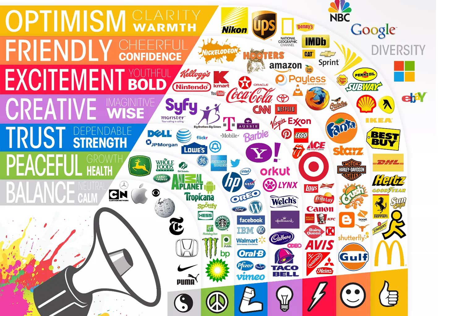
Why Industry-Specific Brand Colours Matter
Industry-specific brand colours are not aesthetic choices alone—they are strategic assets that shape perception, credibility, and emotional connection. When colours are carefully aligned with your industry, they communicate meaning instantly, allowing audiences to understand, trust, and remember your brand without explanation. In competitive markets, colours become a silent yet powerful differentiator.
10 Iconic Brand Colours That Shape Timeless Identities
Colour is one of the most powerful tools in brand identity. When chosen with intention, brand colours move beyond aesthetics to communicate meaning, emotion, and trust. The following ten brand colours have proven their ability to perform across industries—creating recognition, emotional resonance, and long-term brand equity.
Why Brand Colours Are Important in Building a Powerful Brand Identity
Brand colours are far more than a visual preference or aesthetic decision—they are a strategic brand asset that shapes perception, emotion, and memory. The right brand colour palette communicates your story instantly, influences customer behaviour, and creates a deep, lasting connection between your brand and its audience. In today’s competitive digital landscape, colour psychology in branding plays a critical role in standing out, building trust, and driving engagement.
Below is how thoughtfully chosen brand colours work silently—but powerfully—for your business.
Examples of Brand Colours and Their Emotional Associations
Brand colours are one of the most powerful tools in visual identity design. Each colour carries psychological meaning and emotional weight, influencing how audiences perceive a brand within seconds. When used strategically, colour becomes a silent communicator—shaping trust, desire, authority, and recognition across every touchpoint.
Below is a refined breakdown of key brand colours and their associations, curated for modern, premium branding.
Understanding Colour Terms — Made Simple
Choosing the perfect brand colours begins with understanding the language of colour. While colour theory may sound technical, mastering a few essential terms can dramatically elevate how you shape and communicate your brand identity. These fundamentals help you collaborate confidently with designers and ensure your brand palette remains refined, consistent, and intentional across every medium.
The good news? You don’t need to be a designer to understand it. Here’s a clear and simplified guide.