Infographic Colours
Infographics are everywhere because they make complex information simple, visual, and easy to understand. A well-designed infographic turns data, ideas, and stories into content people can quickly read, remember, and share. However, behind every impactful infographic is one crucial decision—choosing the right colour palette.
Colours do more than make designs look attractive. They guide attention, improve readability, and help communicate your message clearly to your audience. The right colour choices can make your infographic engaging, professional, and memorable.
In this guide, we explore the basics of colour theory, how colours influence infographic design, and practical tips for selecting the perfect colour palette. You’ll also discover inspiring colour combinations that work effectively in modern graphic design, helping you create infographics that stand out and perform well across digital platforms.
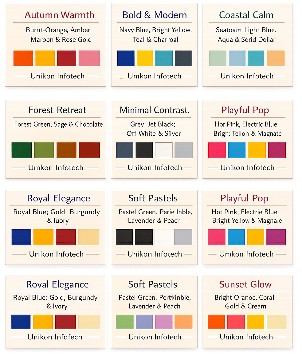
9 Infographic Colour Palettes for a Premium Visual Impact
When designing infographics, clarity must meet creativity. A well-chosen colour palette not only elevates visual appeal but also ensures your message is easy to understand. At Unikon Infotech, we follow modern design standards to craft infographics that feel refined, balanced, and results-driven.
Best practices for infographic colour palettes
Limit your palette to 3–5 core colours
This keeps the design clean, cohesive, and visually luxurious
Follow the 60–30–10 rule
60%: Dominant colour (preferably a neutral tone for elegance)
30%: Secondary colour to support the design
10%: Accent colour to highlight key information
By using these principles, your infographics remain visually premium, easy to scan, and aligned with professional branding.
Understanding Colour Theory in Infographic Design
At Unikon Infotech, we believe colour is not decoration—it is strategy. In premium infographic design, colour theory defines how visuals connect, communicate, and convert. When used with intention, colour enhances clarity, strengthens storytelling, and elevates brand perception.
What Is Colour Theory?
Colour theory explains why certain colours work beautifully together and how they influence human emotion. It begins with the three primary colours—red, yellow, and blue—which blend to form secondary colours like green, orange, and purple, along with countless shades and tones.
Using the colour wheel, designers can craft refined, harmonious palettes that feel deliberate and visually balanced—essential for high-impact infographics.
Key Colour Relationships Include
Complementary colours (opposites on the wheel, like blue & orange): bold and attention-grabbing
Analogous colours (side-by-side, like green & blue): smooth and calming
Triadic colours (evenly spaced, like red, yellow & blue): vibrant yet balanced
How Colour Shapes Your Infographic
Colour does more than look good—it guides perception.
Directing attention: Strategic accents highlight key data, headlines, or insights. A single bold colour can instantly draw the eye where it matters most.
Creating emotion
Warm tones (red, orange): energy, urgency, passion
Cool tones (blue, green): trust, calm, reliability
Choose colours that align with the message you want your audience to feel.
Accessibility matters: High contrast improves readability for everyone, including users with visual impairments. Clear colour contrast is a hallmark of professional, inclusive design.
How to Choose the Right Infographic Colour Scheme
Know your audience: Professional audiences respond to elegant neutrals and cool tones. Younger or creative audiences engage more with bold, playful palettes.
Start with the message: Financial or corporate content pairs well with blues and greys. Celebratory or creative topics thrive with brighter hues.
Design with purpose: Limit palettes to 3–5 colours. Use one dominant colour, one secondary, and an accent for emphasis.
Stay on-brand: Using brand colours builds trust and recognition—just ensure they support readability and clarity.
Expert Tips for Premium Colour Palettes
Follow the 60–30–10 rule: 60% dominant colour, 30% secondary, 10% accent
Embrace white space to keep layouts refined and uncluttered
Use neutrals (white, grey, black) as a luxury foundation
Highlight sparingly with bold colours for hierarchy
Maintain consistency—one colour, one meaning across visuals
Prioritize contrast for effortless reading and clarity
The Unikon Infotech Approach
Exceptional infographics balance aesthetics, psychology, and functionality. At Unikon Infotech, we craft colour systems that are elegant, accessible, and purpose-driven—designed not just to impress, but to perform.
When colour is intentional, design becomes unforgettable.