10 Iconic Brand Colours That Shape Timeless Identities
Colour is one of the most powerful tools in brand identity. When chosen with intention, brand colours move beyond aesthetics to communicate meaning, emotion, and trust. The following ten brand colours have proven their ability to perform across industries—creating recognition, emotional resonance, and long-term brand equity.
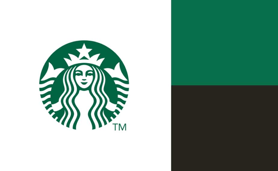
01. Starbucks — A Masterclass in Green Brand Identity
Starbucks has built one of the world’s most recognisable brand identities through a thoughtfully curated family of green hues, supported by a refined set of neutral tones. At the heart of this visual system is the iconic Siren logo, rendered in the unmistakable shade known globally as Starbucks Green—a colour that has become synonymous with the brand itself.
This primary green reflects Starbucks’ heritage, authenticity, and connection to nature, while subtly reinforcing ideas of freshness, balance, and sustainability. Over time, the brand has expanded this core colour into a layered and versatile palette, allowing for consistency across global touchpoints while maintaining visual flexibility.
The extended colour palette incorporates complementary accent greens and carefully selected secondary green tones. These hues are designed to feel welcoming and contemporary, supporting storytelling across packaging, retail environments, digital platforms, and marketing communications. Each shade is calibrated to work harmoniously, creating depth without visual noise.
Neutral colours—such as crisp whites, deep charcoals, and soft greys—anchor the palette, ensuring clarity, legibility, and elegance across all brand applications. This balance between expressive greens and restrained neutrals allows Starbucks to evolve visually while preserving instant recognition.
Starbucks’ colour strategy demonstrates how a single primary hue, when thoughtfully expanded and consistently applied, can evolve into a timeless brand asset. It is a powerful example of how colour, when guided by purpose and restraint, can build emotional connection, global recognition, and enduring brand equity.
02. Instagram — A Contemporary Spectrum of Expression
Instagram’s brand identity is defined by one of the most recognisable colour gradients in the digital world—a seamless transition from deep blue through luminous purples, vivid pinks, and warm oranges, finishing in radiant yellow. This expressive gradient is a refined reinterpretation of the brand’s original rainbow palette, evolved from its earlier skeuomorphic logo into a modern, flat, and dynamic visual system.

The gradient embodies movement, creativity, and emotional warmth, reflecting the ever-evolving nature of the platform itself. Each colour within the spectrum plays a role in conveying energy, optimism, and inclusivity, mirroring the diversity of voices, cultures, and stories shared across the Instagram community.
Beyond aesthetics, this colour system pays homage to the platform’s core function—visual storytelling. From photo filters and video effects to user-generated content, colour is central to how Instagram enables self-expression. The gradient acts as both a symbolic and functional element, reinforcing the brand’s connection to creativity, discovery, and global participation.
When paired with minimalist typography and generous use of white space, Instagram’s vibrant palette achieves balance and clarity. This contrast allows the gradient to stand out as a confident brand signature while maintaining legibility across app interfaces, marketing campaigns, and digital touchpoints.
Instagram’s colour strategy demonstrates how bold, emotionally driven palettes can be refined into timeless brand assets. By embracing colour as a language of expression, the brand has created a visual identity that feels contemporary, recognisable, and deeply connected to its global audience.

03. Google — Timeless Simplicity Through Colour Precision
Google’s logo stands as one of the most recognisable visual identities in the world—simple, approachable, and instantly memorable. Central to this enduring design is its iconic four-colour palette: blue, red, yellow, and green. These primary colours have become inseparable from the Google brand, symbolising curiosity, accessibility, and innovation.
Each colour serves a distinct role within the identity system while working together in perfect balance. The playful sequence of hues communicates openness and human-centred technology, reinforcing Google’s mission to make information universally accessible. Complementing these vibrant tones, white plays a dominant role across Google’s interfaces, creating clarity, focus, and ease of use.
Beyond the primary palette, Google employs a structured system of secondary colours—darker tonal variations of its core hues. These deeper shades provide flexibility and hierarchy, enabling the brand to maintain consistency across an expansive ecosystem of products and services while allowing room for visual nuance.
Tertiary colours, including soft light blues and gentle greens, introduce subtle depth and warmth, supporting user experience without distraction. A carefully calibrated range of greys functions as the brand’s neutral foundation, guiding information delivery through typography, icons, and interface elements with precision and restraint.
Google’s colour strategy exemplifies how simplicity, when executed with intention, can scale globally. Through disciplined colour usage and thoughtful hierarchy, the brand has created a visual system that feels timeless, functional, and instantly recognisable—proving that clarity is one of the most powerful tools in modern brand identity.
04. Dell — A Structured Colour System Built for Scale
Dell’s brand identity is anchored in a meticulously structured colour system designed for clarity, consistency, and global scalability. The palette is organised into three distinct tiers, allowing the brand to communicate innovation and reliability while maintaining disciplined visual control across its vast digital and physical ecosystem.
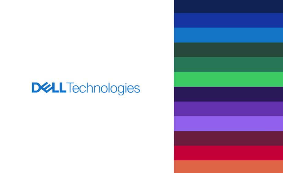
At the core of Dell’s identity is Dell Blue, the brand’s primary colour and most recognisable visual asset. This signature blue conveys confidence, energy, and technological leadership. Supported by two additional blue tones, the first tier establishes a strong and cohesive foundation, ensuring instant recognition across products, platforms, and communications.
The second tier introduces carefully selected accent colours, including refined shades of purple, berry, and orange. These tones add vibrancy and flexibility, allowing Dell to highlight innovation, creativity, and differentiation without overpowering the core identity. Complementing these accents is a neutral palette of white and calibrated grey tones, which ensures clarity, balance, and readability across interfaces and content-heavy environments.
The third tier expands the system further with additional accent colours, offering extended flexibility for campaigns, data visualisation, and specialised applications—while remaining firmly grounded in the brand’s established visual language.
Notably, black is used selectively within Dell’s identity. While permitted for typography and logo usage, it is intentionally excluded as a primary design element. This restraint reinforces consistency and ensures the brand retains its distinctive, forward-looking character.
Dell’s colour strategy exemplifies how disciplined systems enable creative freedom at scale. By structuring its palette with intention and hierarchy, Dell delivers a visual identity that feels vibrant yet controlled—capable of evolving while preserving trust, clarity, and global recognition.
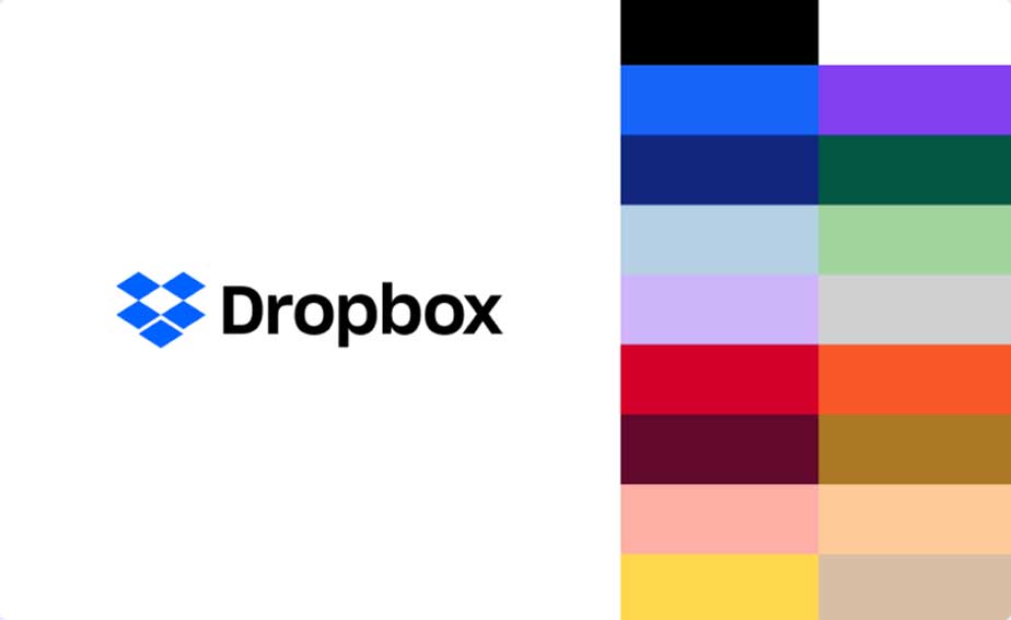
05. Dropbox — A Bold Colour System Designed for Creative Freedom
Dropbox’s brand identity is a masterclass in how colour can be used not merely for recognition, but as a tool for expression, adaptability, and creative storytelling. While the brand is anchored in a familiar foundation of blue, black, and white, its true visual power lies in what extends beyond these core tones.
At the heart of Dropbox’s colour strategy is versatility. The brand employs an expansive palette of 18 carefully curated brand colours, engineered to work in harmony across 32 distinct colour pairings. This system allows Dropbox to move fluidly across platforms, audiences, and creative contexts—without sacrificing coherence or brand clarity.
Rather than relying on strict uniformity, Dropbox embraces dynamic contrast. The palette is intentionally designed to generate unexpected yet balanced combinations, resulting in visual experiences that feel fresh, modern, and intellectually stimulating. These rich colour pairings create depth and personality, enabling the brand to communicate creativity, collaboration, and innovation at every touchpoint.
This approach represents a deliberate departure from traditional brand colour systems that prioritise rigid consistency. Instead, Dropbox’s visual language thrives on mix-and-match flexibility, allowing designers to create compositions that feel expressive and human—while still unmistakably Dropbox.
The result is a brand identity that feels alive and adaptive. Through thoughtful colour combinations rather than strict standardisation, Dropbox reinforces its positioning as a platform built for creative thinkers, modern teams, and fluid workflows.
Dropbox’s colour system proves that when colour is treated as a strategic design asset—rather than a decorative choice—it becomes a powerful driver of engagement, memorability, and brand differentiation in the digital age.
06. Mastercard — A Timeless Colour Identity Built on Trust and Global Prestige
Mastercard’s brand colour palette is a powerful example of how simplicity, symbolism, and strategic restraint can create one of the most recognisable identities in the world. At its core lies the iconic logo: two perfectly balanced, overlapping circles—one red, one yellow—merging to form a distinctive and luminous orange. This resulting orange has become Mastercard’s primary brand colour, instantly evoking ideas of connection, momentum, and universal accessibility.
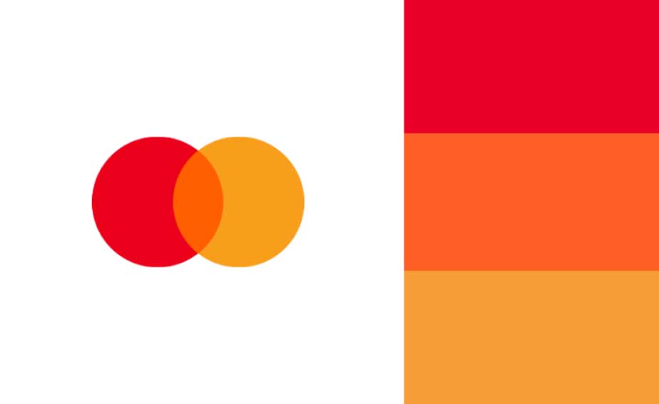
The brilliance of Mastercard’s colour strategy lies in its clarity. The bold orange serves as the emotional and visual anchor of the brand, symbolising energy, confidence, and global movement. Supporting this are two refined neutral tones—light grey and dark grey—used extensively as background colours. These neutrals provide visual stability, allowing the primary colour to command attention while maintaining a clean, premium, and highly legible interface across digital and physical applications.
Beyond the core palette, Mastercard introduces a sophisticated layer of secondary colours—gold, yellow, and green. These hues reinforce the brand’s associations with value, prosperity, growth, and financial optimism. Gold adds a sense of prestige and reward, yellow enhances warmth and approachability, while green subtly communicates progress and sustainability in a modern financial ecosystem.
The palette is further elevated through carefully selected accent colours, including red and teal. Red reinforces the brand’s original energy and heritage, while teal introduces a contemporary contrast—adding freshness, innovation, and digital-forward appeal without overpowering the identity.
What makes Mastercard’s colour system truly exceptional is its strategic balance. Each colour has a clearly defined role, ensuring visual harmony across regions, cultures, and platforms. The result is a brand identity that feels globally consistent yet emotionally resonant, modern yet timeless.
Mastercard’s use of colour demonstrates how a thoughtfully structured palette can transcend design trends—building trust, recognition, and premium value at a global scale.
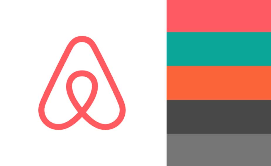
07. Airbnb — A Human-Centric Colour Palette That Redefines Belonging
Airbnb’s brand colour palette is a masterclass in emotional branding and human connection, carefully designed to feel warm, inclusive, and globally relatable. At the heart of the identity lies Rausch, Airbnb’s signature pink—an instantly recognisable hue that serves as both the logo colour and the brand’s primary colour. Unlike traditional corporate tones, Rausch is intentionally expressive, symbolising hospitality, openness, and the joy of shared experiences.
This iconic pink is used consistently across Airbnb’s digital platforms, marketing materials, and interface design, creating a strong sense of familiarity and emotional continuity. It invites users in—communicating warmth, creativity, and a feeling of welcome that mirrors the brand’s core philosophy of belonging anywhere.
Supporting the primary colour is a thoughtfully curated selection of secondary brand colours, each contributing a distinct emotional layer. A calming turquoise introduces balance and serenity, evoking oceans, open skies, and the sense of escape that travel inspires. This hue softens the vibrancy of Rausch while reinforcing Airbnb’s connection to global destinations and relaxed living.
A vibrant orange adds warmth and energy to the palette, reflecting spontaneity, adventure, and cultural discovery. Used sparingly as an accent, orange enhances visual interest and encourages interaction without overwhelming the overall aesthetic.
To ground the palette and ensure clarity across all touchpoints, Airbnb incorporates two refined neutral tones—dark grey and light grey. These neutrals provide structure, readability, and elegance, allowing the more expressive colours to shine while maintaining a clean, modern, and highly usable design system.
What sets Airbnb’s colour strategy apart is its perfect balance between emotion and usability. The palette is bold yet approachable, modern yet timeless, expressive yet controlled. Every colour is assigned a purpose, ensuring consistency across web, mobile, print, and environmental branding.
Through this carefully orchestrated use of colour, Airbnb has created a visual identity that feels personal, aspirational, and deeply human—one that transcends borders, cultures, and languages while remaining unmistakably Airbnb.
08. LEGO — The Playful Bubble Letters That Turn Imagination into an Icon
The LEGO logo stands as one of the most enduring and emotionally powerful identities in global branding—an emblem that has transformed playful typography into a symbol of creativity, trust, and timeless appeal. Designed in 1973 by the LEGO Group’s in-house design team, the current version of the logo has remained remarkably consistent for over five decades, reinforcing LEGO’s position as a brand that evolves without ever losing its soul.
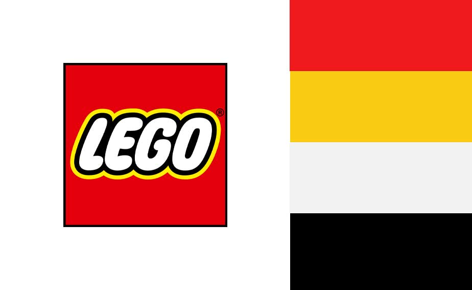
At the heart of the LEGO identity are its bold, bubble-style letters—rounded, compact, and instantly recognisable. This distinctive typography communicates friendliness and approachability while evoking the pure joy of childhood imagination. The soft curves and thick letterforms feel tactile and playful, subtly mirroring the physical experience of LEGO bricks themselves—stackable, solid, and endlessly creative.
The logo’s vibrant colour palette, led by high-contrast primary tones, ensures exceptional visibility across all brand touchpoints—from toy packaging and retail displays to digital platforms and global marketing campaigns. These colours are not merely decorative; they are strategic, designed to stimulate curiosity, energy, and emotional engagement across generations and cultures.
What elevates the LEGO logo into the realm of iconic luxury branding is its unwavering consistency. For more than 50 years, LEGO has resisted unnecessary redesigns, understanding that trust is built through familiarity. This disciplined approach has allowed the logo to become deeply embedded in collective memory, creating an emotional bond that extends far beyond products.
The LEGO logo perfectly encapsulates the brand’s core values—playfulness, innovation, learning, and creativity—while maintaining a clean, confident, and premium presence. It speaks equally to children discovering imagination for the first time and to adults rediscovering it through design, engineering, and storytelling.
Through its playful bubble letters, LEGO has achieved what few brands can: a visual identity that is joyful yet authoritative, simple yet powerful, and timeless in a fast-changing world. It is not just a logo—it is a global symbol of creativity without limits.
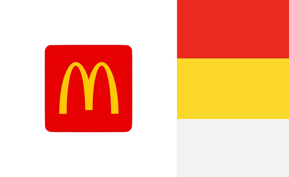
09. McDonald’s — The Golden Arches: A Timeless Symbol of Global Comfort and Consistency
McDonald’s brand identity stands as one of the most powerful and enduring examples of visual branding in modern history, anchored by the legendary Golden Arches. Designed in 1961 by Jim Schindler, the iconic “M” has transcended generations, cultures, and geographies to become a universal symbol of familiarity, convenience, and comfort food. Few brand marks in the world command the instant recognition and emotional recall that the Golden Arches achieve effortlessly.
At the core of McDonald’s visual language lies its strategic use of colour—most notably the bold combination of golden yellow and red. The radiant yellow of the arches symbolises warmth, optimism, and happiness, naturally stimulating appetite and drawing attention even from a distance. This hue reflects energy, friendliness, and positivity, making it ideal for a brand built around quick service and everyday joy. Psychologically, yellow evokes cheerfulness and accessibility, reinforcing McDonald’s promise of a welcoming experience for all.
Complementing this is McDonald’s signature red, a colour deeply associated with excitement, passion, and hunger stimulation. Red accelerates decision-making and enhances appetite, making it a powerful tool within the fast-food industry. Together, red and yellow create a high-impact visual system that is both emotionally engaging and functionally effective—perfectly aligned with McDonald’s fast-paced, customer-centric philosophy.
The shape of the Golden Arches itself carries subtle yet powerful meaning. Inspired by the architectural arches of early McDonald’s restaurants, the inverted “V” form resembles open doors, symbolising approachability, openness, and universal welcome. Over time, this architectural reference evolved into a refined, standalone logo that no longer needs text to communicate its identity.
What elevates McDonald’s branding into a league of its own is its unwavering consistency. Across digital platforms, packaging, signage, advertising, and physical environments, the Golden Arches remain visually cohesive and instantly recognisable. This consistency has built deep emotional connections, often tied to childhood memories, shared family moments, and cultural rituals.
Through simplicity, strategic colour psychology, and timeless design, McDonald’s has created a luxury of familiarity—an iconic global brand identity that delivers trust, comfort, and instant recognition at every touchpoint, everywhere in the world.
10. Shell — A Timeless Colour Language Powering Global Trust
Shell’s visual identity stands as one of the most enduring and recognisable examples of strategic brand design in the world of energy. At the core of Shell’s branding lies its iconic scallop shell emblem—an instantly identifiable symbol that transcends language, geography, and culture. First introduced in 1900 and refined over decades, the modern Shell logo, shaped under the influence of legendary designer Raymond Loewy, represents a masterful balance between heritage, clarity, and contemporary relevance.
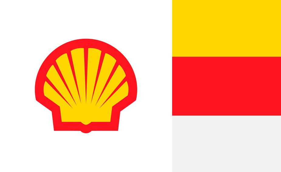
What truly elevates Shell’s brand identity is its bold and purposeful colour palette. The dominant use of vibrant red and radiant yellow is not accidental—it is deeply rooted in visibility, psychology, and global recognition. Yellow, bright and optimistic, conveys energy, innovation, and accessibility, while red adds strength, confidence, and momentum. Together, these colours create a high-contrast visual system that ensures instant recognition across fuel stations, digital platforms, industrial infrastructure, and global advertising environments.
Shell’s colour strategy is designed for performance at scale. Whether viewed from a distance on a highway, on a mobile screen, or within corporate communications, the palette delivers exceptional clarity and memorability. The consistency of these colours across continents reinforces trust and reliability—key emotional drivers in the global energy sector.
Beyond visibility, Shell’s branding communicates stability and forward-thinking evolution. Over time, the logo has been refined to remove unnecessary complexity, embracing simplicity without compromising its historic essence. This disciplined evolution reflects Shell’s ability to modernise while remaining anchored in its legacy—an approach that mirrors its role as a dependable yet innovative global energy leader.
From an SEO and brand positioning perspective, Shell’s identity exemplifies how strong colour psychology, timeless design, and strategic consistency can build long-term brand equity. The Shell logo is more than a mark—it is a global symbol of endurance, engineering excellence, and energy leadership.
For brands seeking to establish authority, trust, and worldwide recognition, Shell’s visual identity offers a powerful blueprint—one that proves great design, when paired with purposeful colour, can fuel a brand for over a century.