Examples of Brand Colours and Their Emotional Associations
Brand colours are one of the most powerful tools in visual identity design. Each colour carries psychological meaning and emotional weight, influencing how audiences perceive a brand within seconds. When used strategically, colour becomes a silent communicator—shaping trust, desire, authority, and recognition across every touchpoint.
Below is a refined breakdown of key brand colours and their associations, curated for modern, premium branding.
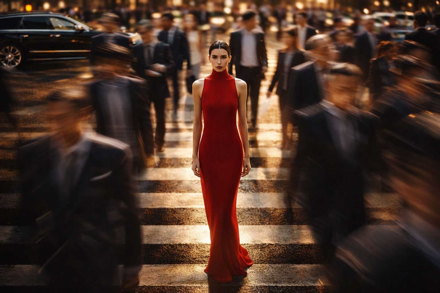
Red — Energy, Passion, and Urgency
Red is bold, dynamic, and impossible to ignore. It stimulates emotion, raises energy levels, and creates a sense of urgency, making it highly effective for sales-driven campaigns, food and beverage brands, and high-impact calls to action. Red communicates confidence, passion, and movement—ideal for brands that want to feel powerful, exciting, and immediate.
In luxury contexts, deeper reds such as burgundy or crimson convey intensity with sophistication.
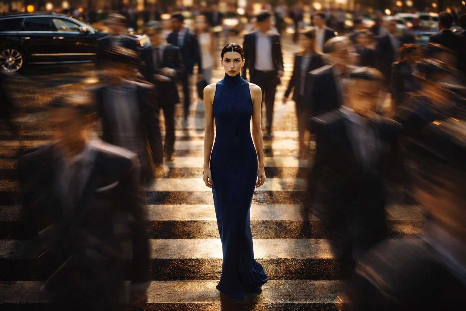
Blue — Trust, Stability, and Reliability
Blue is universally associated with trust, intelligence, and calm authority. It is one of the most widely used brand colours in finance, healthcare, technology, and corporate branding due to its ability to inspire confidence and reassurance.
From deep navy tones that convey professionalism and strength to lighter blues that feel open and approachable, blue establishes credibility and long-term reliability—essential for brands that handle responsibility, data, or care.
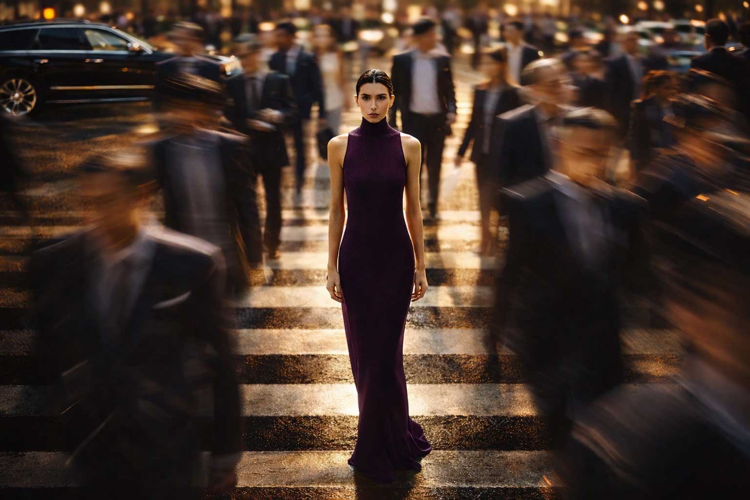
Purple — Luxury, Creativity, and Imagination
Purple has long been linked with royalty, prestige, and exclusivity. In modern branding, it balances luxury with creativity, making it ideal for beauty brands, premium products, wellness, and artistic industries.
Deep purples signal elegance and sophistication, while softer lavender tones evoke calmness and innovation. Purple is a powerful choice for brands that want to stand out while maintaining an aspirational identity.
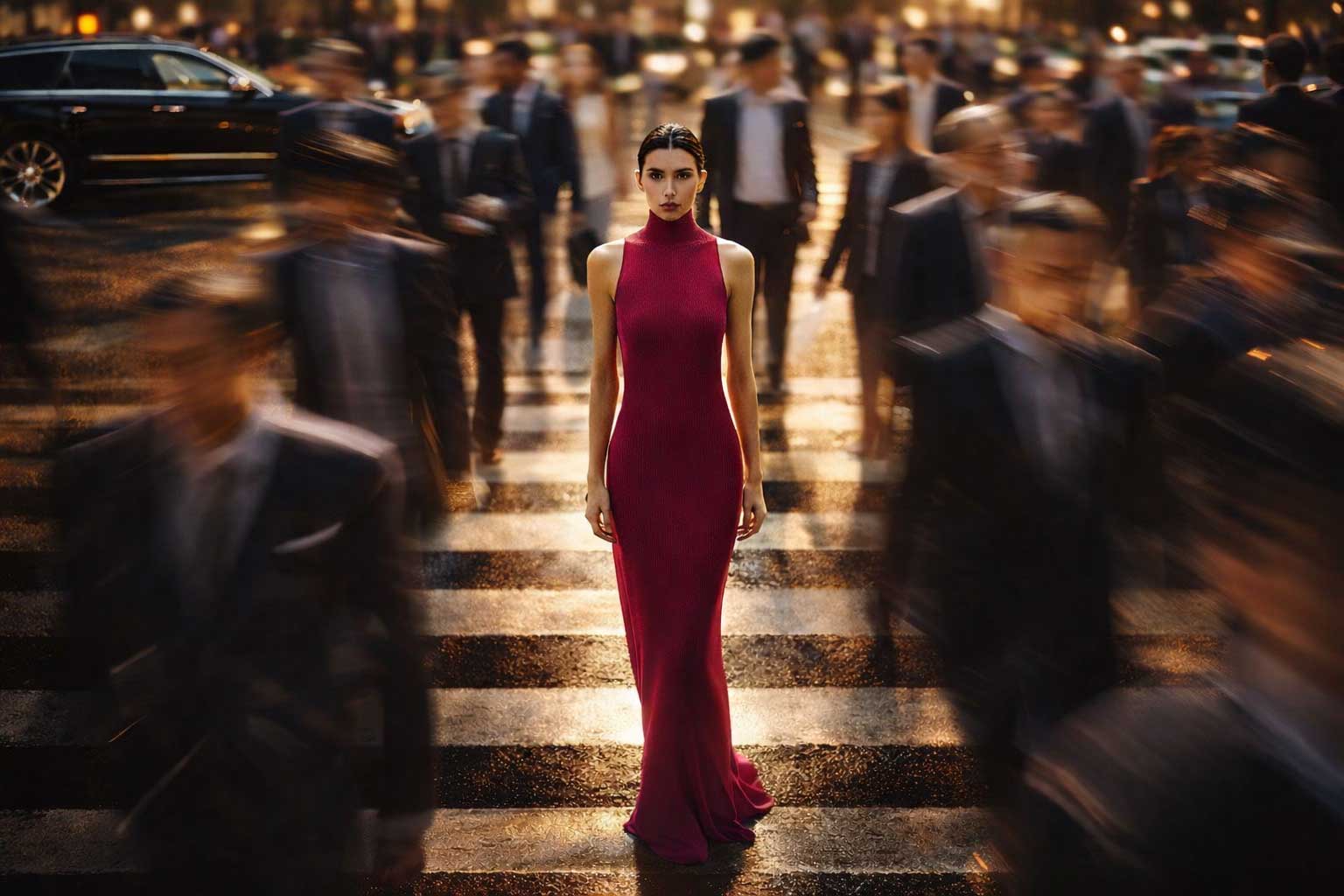
Pink — Playfulness, Emotion, and Self-Expression
Pink represents warmth, charm, and emotional connection. It is often used in youth-focused campaigns, lifestyle brands, beauty, and self-expression-driven narratives. Lighter pinks feel soft and approachable, while bold or muted blush tones can communicate confidence and modern femininity.
When used thoughtfully, pink can feel premium, contemporary, and expressive—far beyond its playful stereotypes.

Black — Sophistication, Authority, and Timeless Luxury
Black is the ultimate symbol of elegance, power, and control. It is a cornerstone of luxury branding, high-end fashion, minimalist design, and premium services. Black creates contrast, commands attention, and conveys exclusivity without excess.
In branding, black suggests confidence and refinement—making it ideal for brands that value timeless design and understated authority.
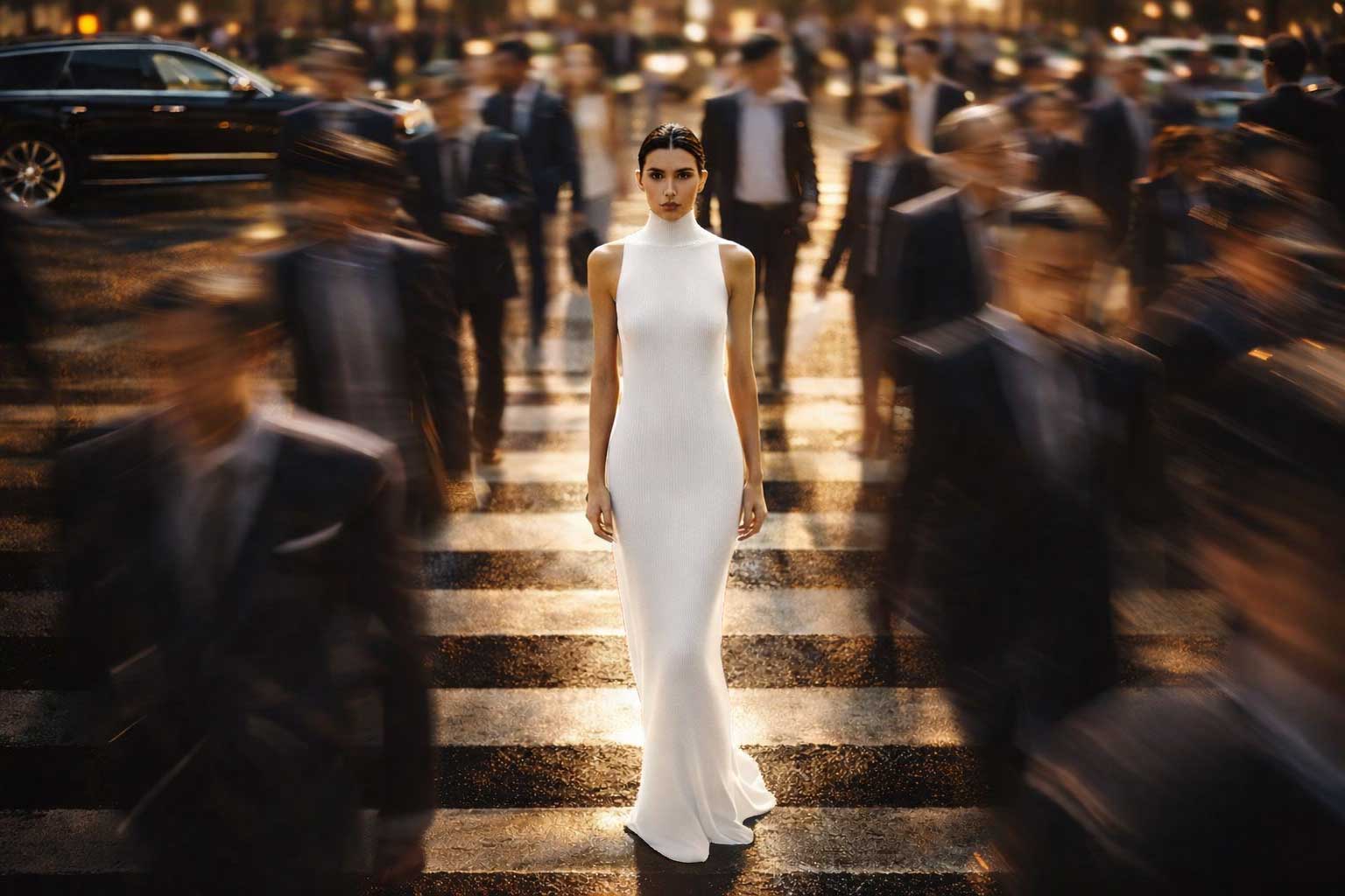
White — Purity, Simplicity, and Clarity
White represents openness, cleanliness, and modern simplicity. It is widely used in technology, wellness, healthcare, and minimalist brand identities to create space, clarity, and focus.
As a brand colour, white enhances readability and elegance, allowing other colours to shine while reinforcing a sense of honesty, transparency, and balance.
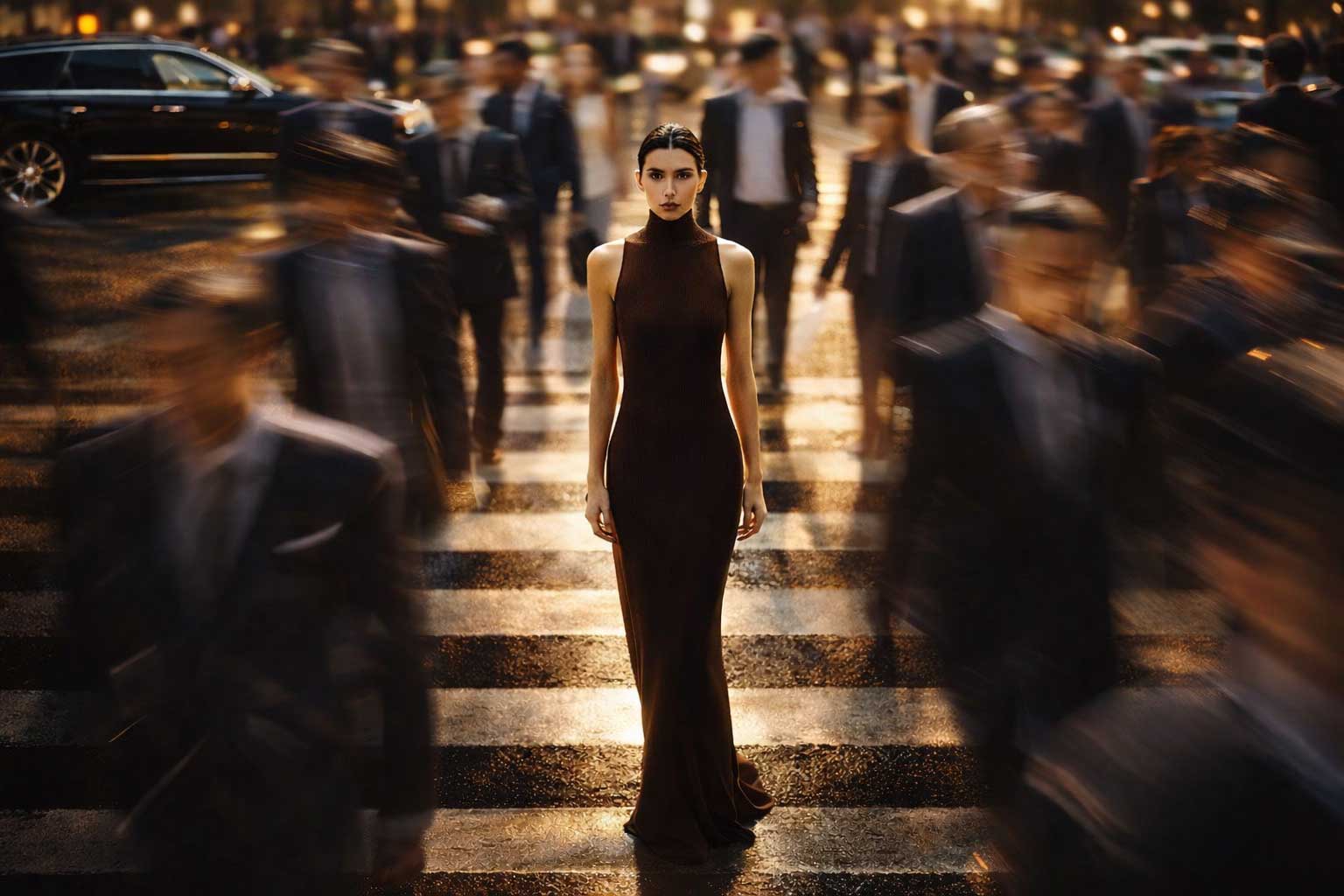
Brown — Earthiness, Reliability, and Authenticity
Brown is grounded, warm, and reassuring. It evokes nature, craftsmanship, and dependability, making it a popular choice for sustainable brands, organic products, outdoor companies, and heritage-driven businesses.
In premium branding, rich browns paired with neutrals or metallic accents communicate authenticity, tradition, and long-lasting value.
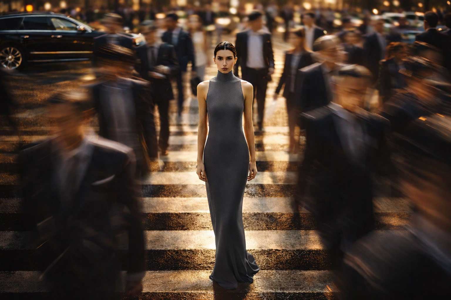
Gray — Neutrality, Maturity, and Professionalism
Gray is refined, balanced, and understated. It conveys neutrality, wisdom, and modern professionalism, making it ideal for corporate branding, architecture, industrial design, and technology brands.
Often used as a supporting or neutral colour, gray adds sophistication and stability while allowing stronger colours to stand out without overwhelming the design.
Colour as a Strategic Brand Language
Each brand colour tells a story. When selected intentionally and aligned with your brand values, colours become an emotional language—guiding perception, building trust, and strengthening recognition. A luxury brand identity isn’t just seen; it’s felt, and colour is at the heart of that experience.