Type Properties
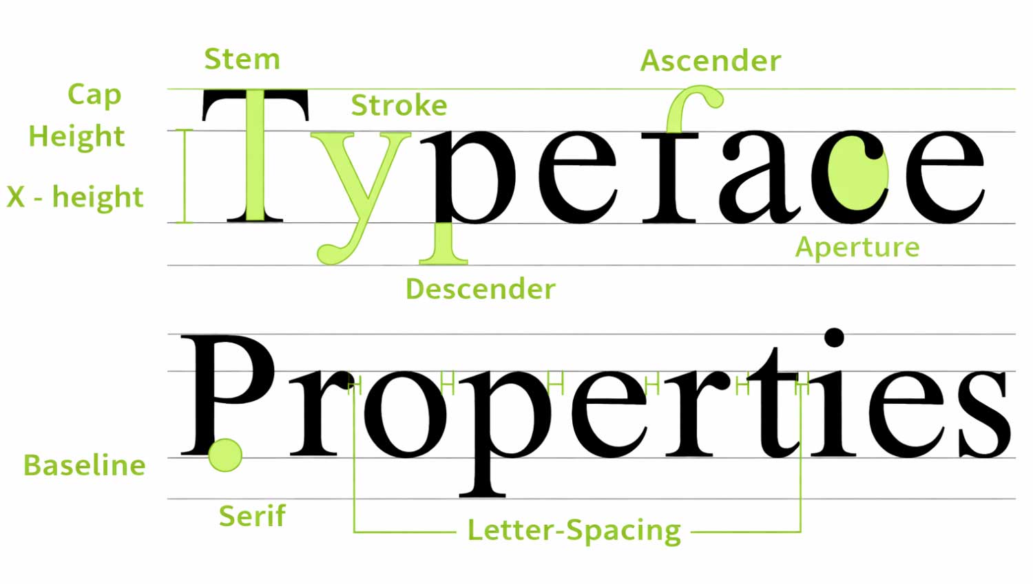
A typeface is a meticulously designed system of letterforms that work together in perfect visual harmony. While every letter retains its own unique identity, a typeface is defined by the shared structural patterns, proportions, and stylistic details that unite the entire character set.
At its highest level, typography is not decoration—it is precision design. Typefaces chosen for their aesthetic sophistication, legibility, and readability form the backbone of exceptional visual communication. When aligned with the core principles of typographic design, they enhance clarity, strengthen brand presence, and deliver a seamless reading experience across all platforms.
Luxury typography prioritizes balance, proportion, and consistency—ensuring that every character contributes to a cohesive and elevated brand expression.
1. Baseline
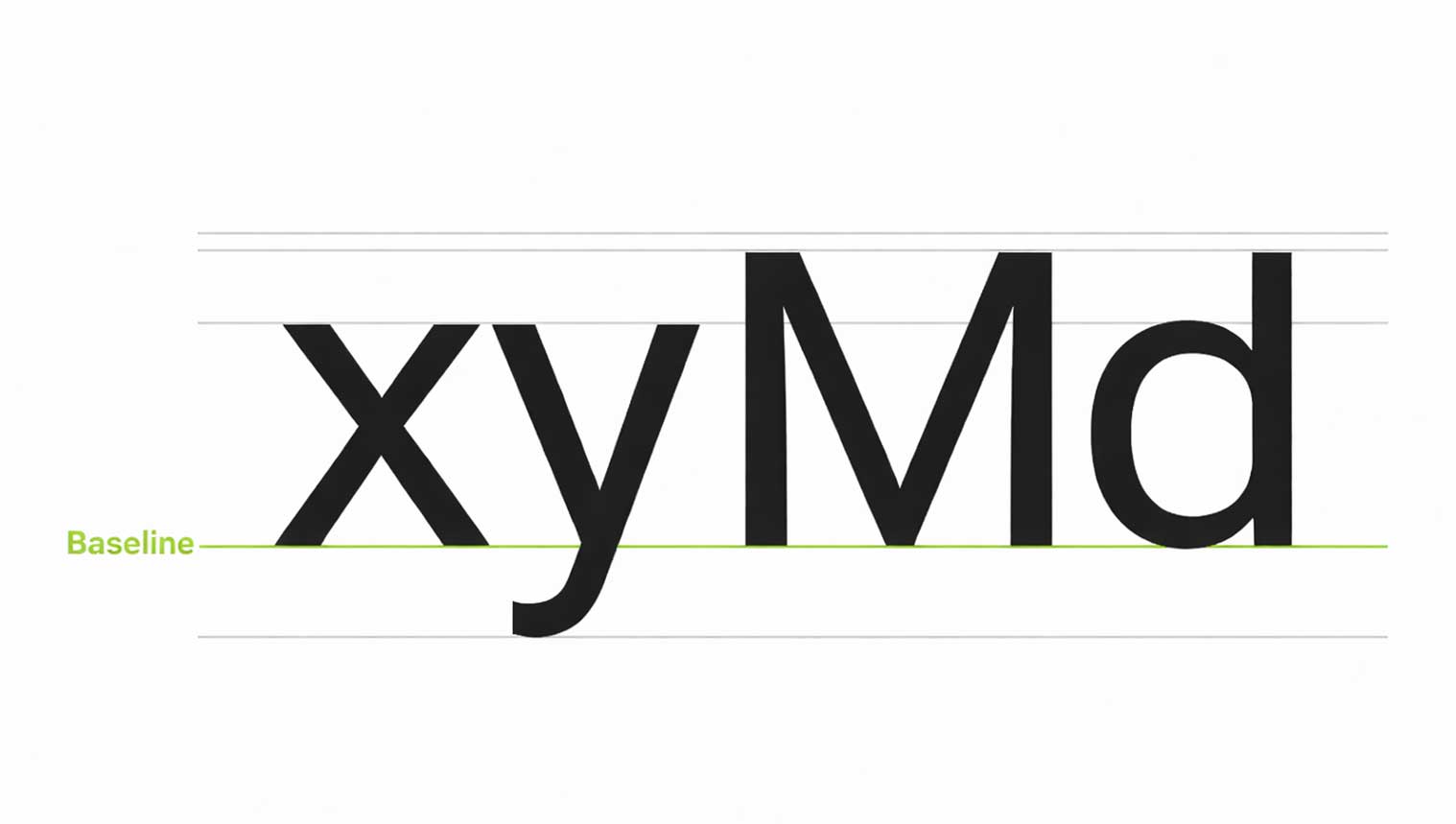
The Invisible Axis of Typographic Precision
The baseline is the invisible line on which text sits. It creates order, balance, and visual harmony in typography.
In Material Design, the baseline is a key reference point used to measure the vertical spacing between text and other UI elements. Instead of relying on bounding boxes, designers use the baseline to achieve precise alignment and consistent spacing across layouts.
4dp Baseline Grid
The 4dp grid is a system that keeps text perfectly aligned across digital designs. All text, no matter the font size (pt or sp), must sit on this grid to maintain visual consistency.
To keep alignment accurate, the line height should always be divisible by 4. This ensures balanced spacing, better readability, and a clean layout across screens and devices.
Using a 4dp baseline grid improves typography structure, enhances user experience, and creates professional, scalable designs—making it a best practice in modern UI and web design.
Measuring Text from the Baseline
In modern UI and web design, text spacing should always be measured from the baseline, not from the text box. This creates better alignment and visual balance across layouts.
Baseline measurements are software-independent, which means they work seamlessly in all design tools. On Android and iOS, baseline values can be converted directly into padding for accurate development. For web design, these measurements can be automated using CSS or Sass, ensuring consistency across devices.
Using baselines instead of bounding boxes results in more precise vertical alignment, improved readability, and a polished user interface. Always measure text in relation to surrounding components for a clean and professional design system.
2. Cap Height in Typography
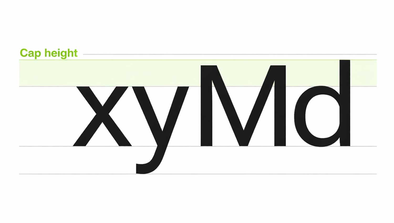
Cap height refers to the height of flat capital letters such as M or I, measured from the baseline. It defines how tall uppercase letters appear in a typeface.
Rounded or pointed letters like A and S slightly extend above the cap height. This optical adjustment helps them appear visually equal in size. Every typeface has its own unique cap height, which plays an important role in text alignment, readability, and overall design consistency.
3. X-Height in Typography
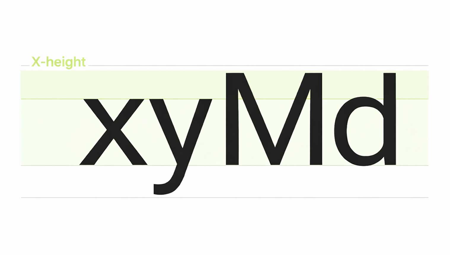
X-height refers to the height of the lowercase “x” in a typeface. It helps determine how tall or short lowercase letters appear overall.
Fonts with a larger x-height are easier to read, especially at small sizes, because the letters have more open space inside them. This improves clarity, legibility, and reading comfort across digital and print designs.
4. Ascenders and Descenders in Typography
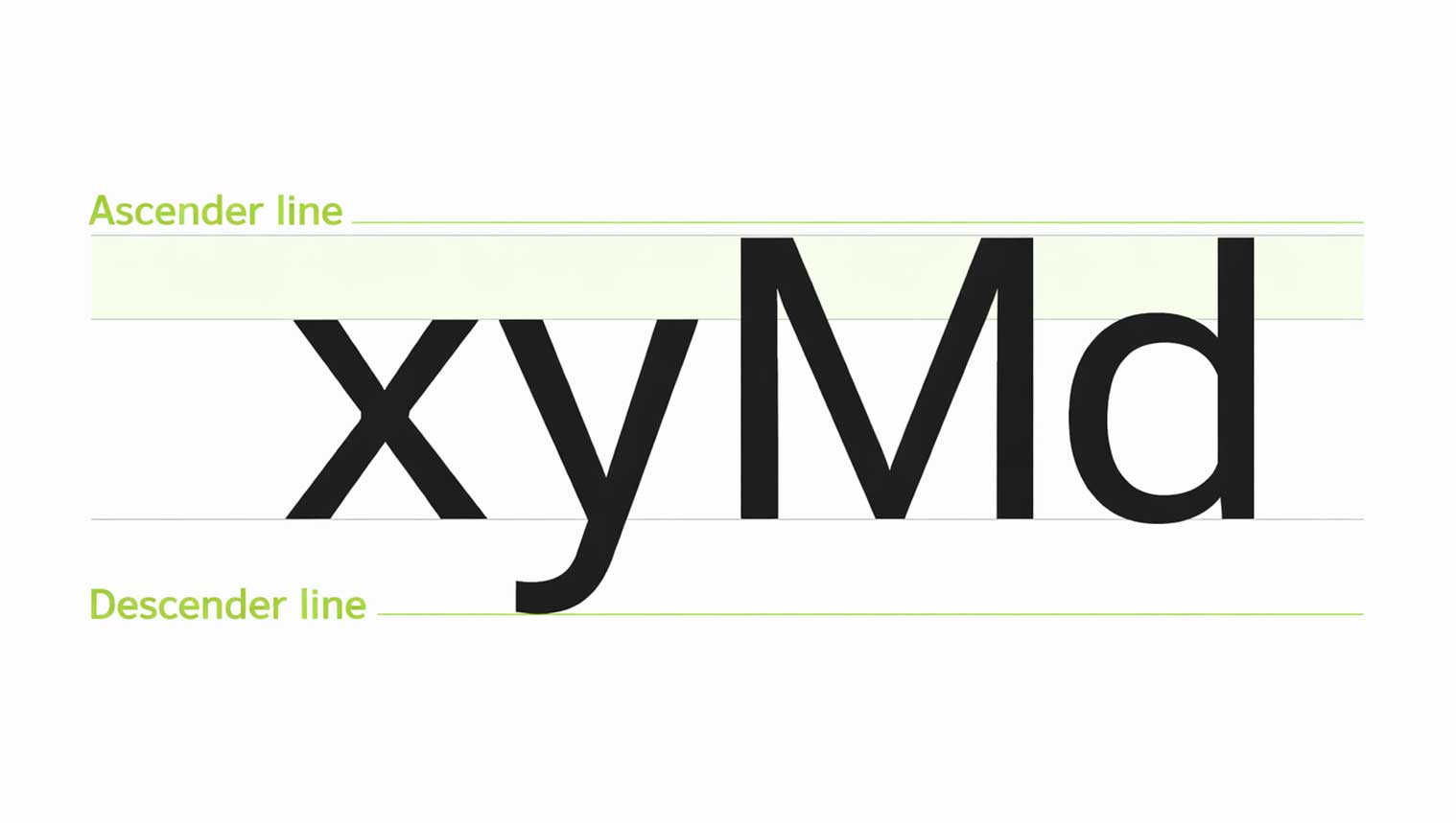
Ascenders are the upward strokes in lowercase letters like b, d, h, and l that rise above the x-height. Descenders are the downward strokes in letters such as g, j, p, and y that extend below the baseline.
Proper spacing between lines is essential. When line height is too tight, ascenders and descenders can overlap, reducing readability. Well-balanced spacing ensures clean typography, visual harmony, and a polished reading experience across all digital and print designs.
5. Font Weight in Typography
Font weight defines the thickness of a typeface’s strokes and plays a key role in visual hierarchy and brand clarity. Most typefaces are available in multiple weights, typically ranging from four to six variations.
Common font weights include Light, Regular, Medium, and Bold. Using different weights helps highlight important content, improve readability, and create balance across headings, subheadings, and body text—especially in modern web and UI design.
Common font weights
- Light
- Regular
- Medium
- Bold
 +91 9890181399