Type Classification
Type classification is the process of grouping typefaces based on their design structure, visual style, and usage. Understanding these categories helps brands choose fonts that align with their identity, enhance readability, and create a strong visual presence across digital platforms.
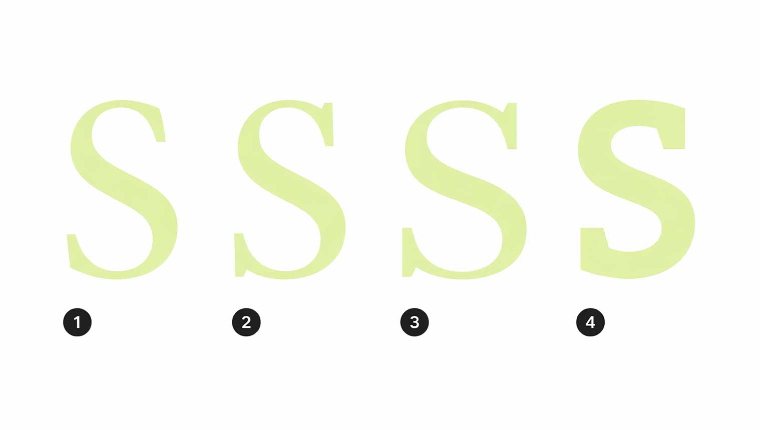
1. Serif Typefaces
A serif is a small decorative stroke that appears at the beginning or end of a letter’s main stroke. Fonts that include these details are known as serif typefaces. Serif fonts are widely used in branding, publishing, and editorial design because they convey tradition, elegance, and credibility.
Serif typefaces are categorized into distinct styles based on their structure and visual balance:
Old-Style Serif Fonts
- Old-style serifs resemble classic ink handwriting and feel warm and timeless.
- Low contrast between thick and thin strokes
- Diagonal stroke stress
- Soft, slanted serifs on lowercase letters
They feature:
Transitional Serif Fonts
- Transitional serifs represent a balance between tradition and modern clarity.
- Higher contrast between thick and thin strokes
- Medium to high x-height for better readability
- Vertical stroke stress
- Gently curved (bracketed) serifs
They include:
Didone (Neoclassical) Serif Fonts
- Didone serifs are bold, refined, and luxurious in appearance.
- Very high contrast between thick and thin strokes
- Strong vertical stress
- Rounded or “ball” terminals
- Serif typefaces are ideal for brands that want to communicate heritage, sophistication, and authority, making them a strong choice for luxury design, publishing, and premium digital experiences.
They are known for:
Slab Serif Typefaces
- Slab serif fonts are defined by their bold, heavy serifs and strong visual structure. Unlike traditional serif fonts, slab serifs have little to no variation in stroke thickness, giving them a confident and modern appearance.
Key characteristics of slab serif typefaces include:
- Thick, block-like serifs with minimal or no bracketing
- Nearly uniform stroke weight across letters
- Strong readability and high visual impact
- EB Garamond, old-style serif
- Libre Baskerville, transitional serif
- Libre Bodoni, didone / neoclassical serif
- Bitter, slab serif
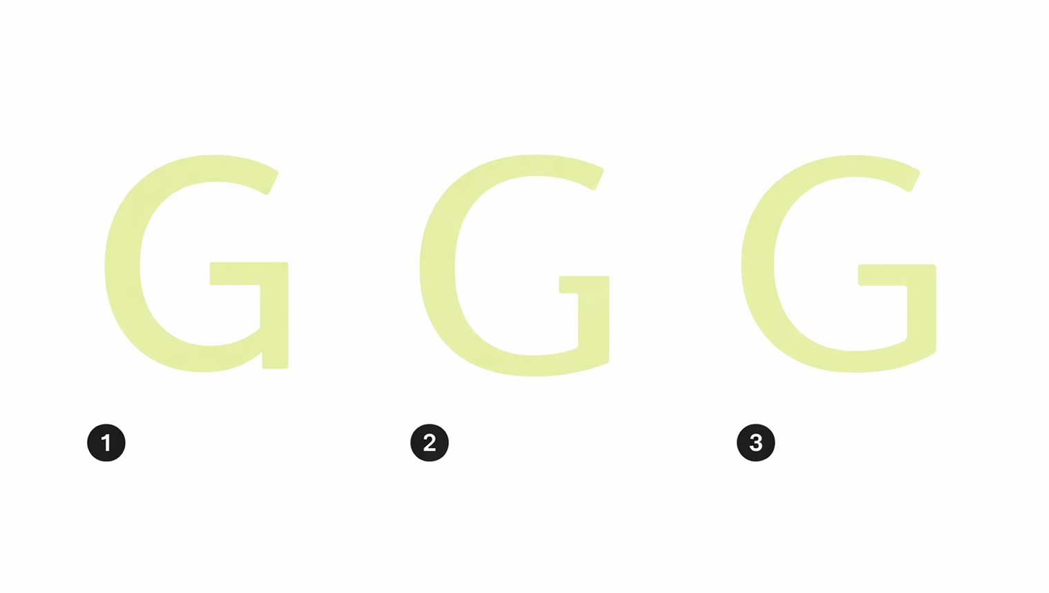
2. Sans Serif Typefaces
o Sans serif fonts are typefaces designed without decorative strokes (serifs) at the ends of letters. Derived from the French word “sans,” meaning “without,” these fonts are known for their clean, modern, and highly readable appearance—making them a preferred choice for digital design, UI/UX, and contemporary branding.
Sans serif typefaces are commonly classified into three main categories:
Grotesque Sans Serif
- Grotesque fonts feature low contrast between thick and thin strokes with little to no visible stress. They feel neutral, professional, and functional, making them ideal for corporate and interface design.
Humanist Sans Serif
- Humanist fonts have moderate stroke contrast and a slightly angled stress, inspired by handwritten forms. This gives them a warm, approachable, and human feel, perfect for user-focused digital experiences.
Geometric Sans Serif
- Geometric fonts are built using simple shapes like circles and straight lines, with minimal stroke contrast and vertical stress. They create a bold, modern, and structured look, often used by innovative and luxury tech brands.
- Work Sans, grotesque sans serif
- Alegreya Sans, humanist sans serif
- Quicksand, geometric sans serif
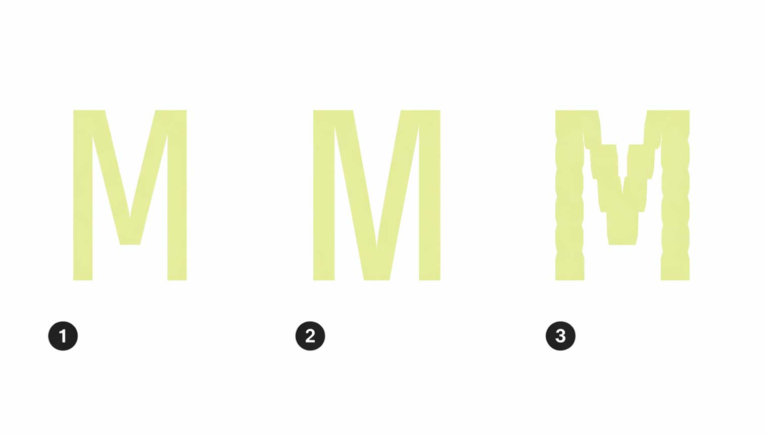
3. Monospace Typefaces
Monospace fonts are typefaces where every character occupies the same horizontal width, whether it’s a letter, number, or symbol. This uniform spacing creates a clean, structured, and highly organized appearance, making monospace typography instantly recognizable.
Because of their consistent alignment, monospace typefaces are widely used in coding environments, data tables, technical interfaces, and digital systems where clarity and precision are essential. They allow content to scan easily and keep columns perfectly aligned.
- Roboto Mono, monospace
- Space Mono, monospace
- VT323, monospace
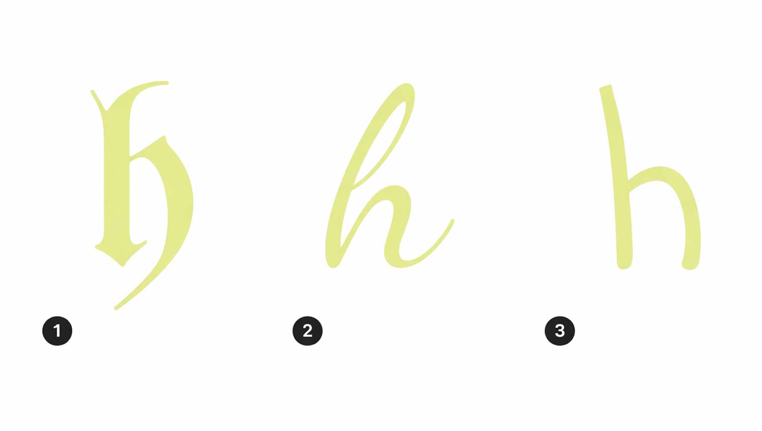
4. Handwriting Typefaces
Handwriting fonts are expressive typefaces that mimic natural, human writing. They add warmth, personality, and a personal touch to a design, making them ideal for headlines (H1–H6), brand accents, and creative highlights rather than long body text.
These fonts are commonly used to create an emotional connection and give brands a more approachable and authentic feel. Handwriting typefaces fall into three main styles:
- Blackletter: Bold and dramatic, with sharp angles and high contrast, often used for heritage or luxury themes.
- Script: Elegant and flowing, inspired by calligraphy, suitable for premium and formal branding.
- Handwriting: Casual and relaxed, closely resembling real handwriting, perfect for friendly and modern designs.
- When used thoughtfully, handwriting fonts enhance brand identity while maintaining readability and visual appeal.
- UnifrakturMaguntia, black letter
- Dancing Script, script
- Indie Flower, handwriting
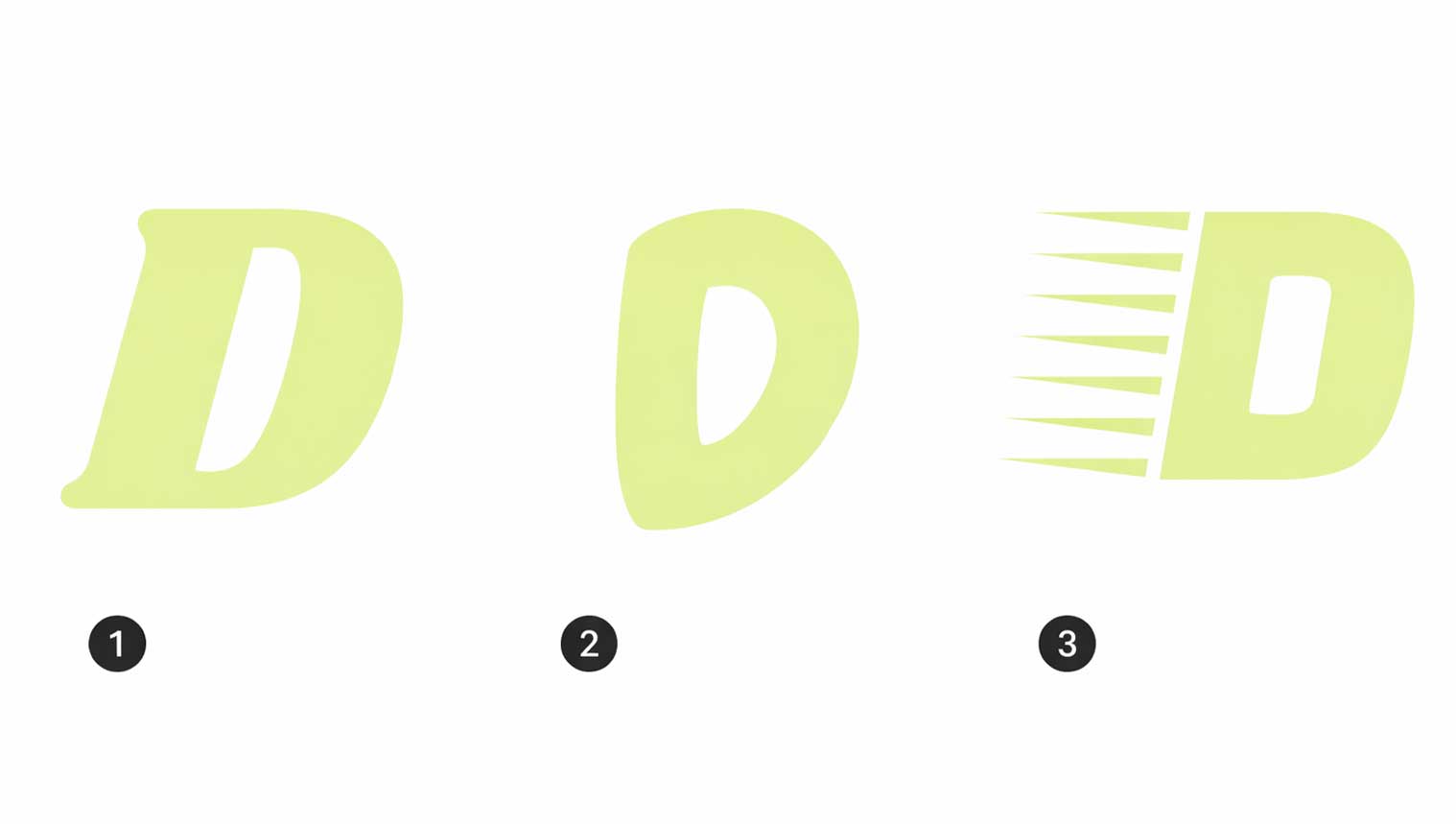
5. Display Fonts
Display fonts are a special category of typefaces designed for large text sizes. They are best used for headings, not for long paragraphs.
These fonts work perfectly for H1 to H6 headings in your type scale. Because of their bold and decorative style, display fonts help grab attention and improve visual impact.
When to use display fonts
- Website headings (H1, H2, H3, H4, H5, H6)
- Banners and hero sections
- Logos and promotional text
Display fonts are not suitable for body text, as they are meant to be seen clearly at large sizes only. Using them correctly improves readability, design quality, and SEO-friendly structure on your website.
- Shrikhand, display
- Chewy, display
- Faster One, display