Readability
Readability is about how easy it is to read words and text blocks. Unlike legibility, which depends on individual characters, readability is influenced by the overall style of a typeface. Fonts with good spacing, clear shapes, and balanced design make content easier to read. High readability improves user experience, keeps visitors engaged, and supports better SEO performance. Using readable fonts helps users understand your content faster and helps search engines rank your website higher.
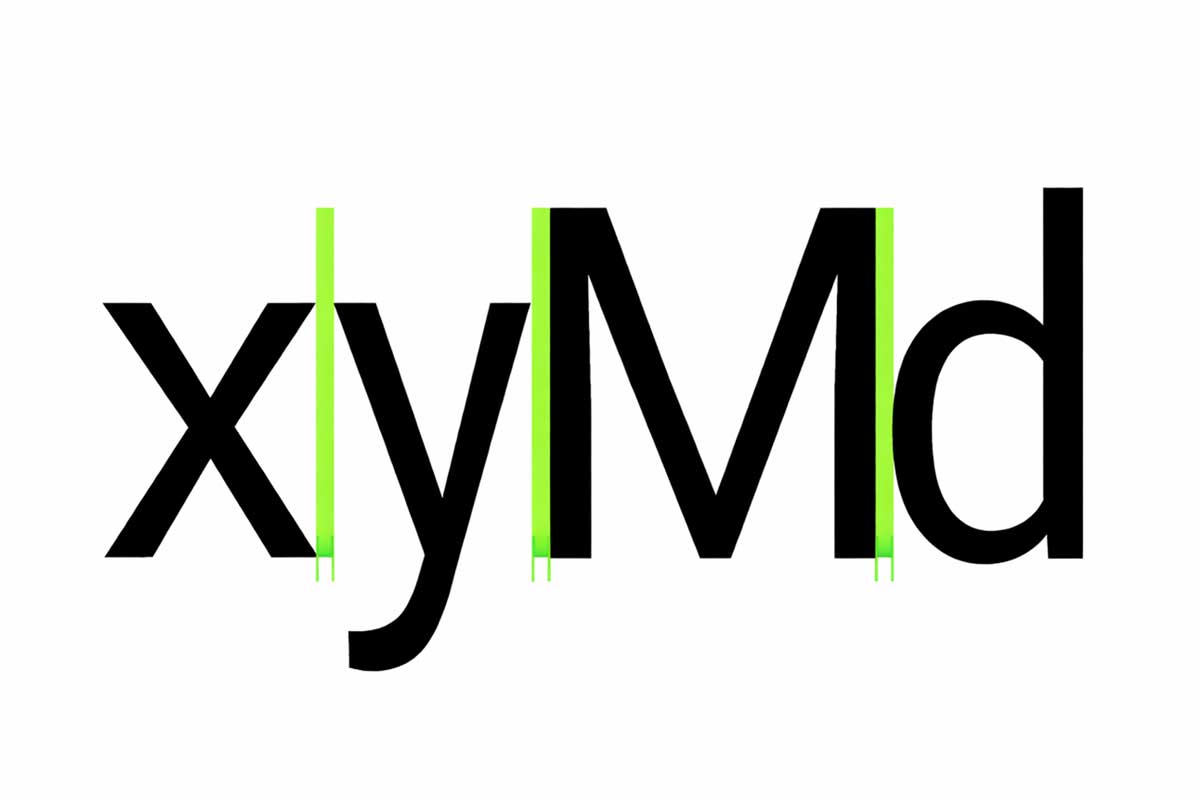
1. Letter Spacing (Tracking)
How letter spacing works
Large text and headlines use tighter letter spacing to reduce extra gaps and improve readability.
Small text sizes benefit from looser letter spacing, which makes each letter easier to recognize.
2. Tabular Figures
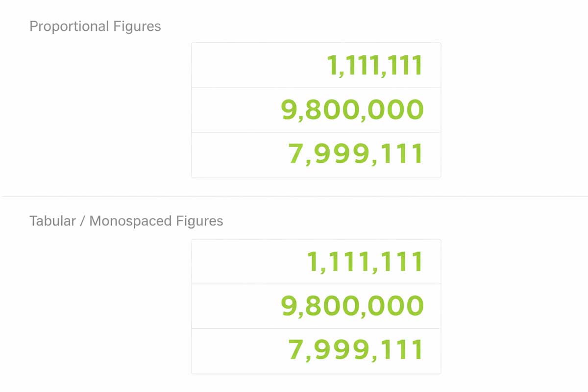
Tabular figures, also called monospaced numbers, use equal spacing for every digit. This makes numbers line up perfectly in rows and columns.
They are best used in tables, charts, and data-heavy sections where numbers change often. Tabular figures improve accuracy, readability, and visual consistency.
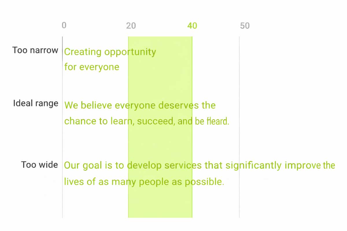
3. Line Length
Line length refers to the number of characters in a line of text. Proper line length improves readability and user experience.
For body text, the ideal line length is 40 to 60 characters. This makes reading comfortable and reduces eye strain.
On wider screens like desktop, longer lines can go up to 120 characters. In such cases, increasing the line height from 20sp to 24sp helps keep text easy to read.
The ideal line length is 40-60 characters per line for English body text.
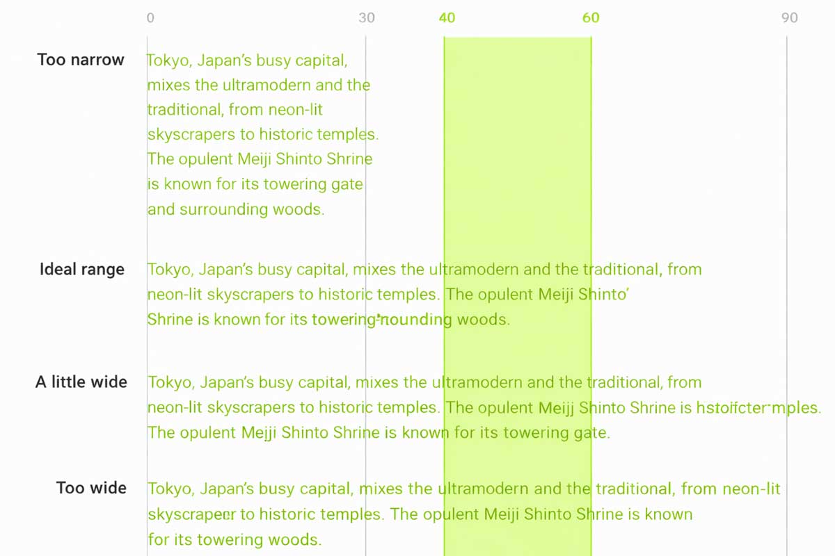
The ideal line length for short lines of English text is 20-40 characters per line.
4. Line Height
Line height, also called leading, defines the vertical space between lines of text. It plays a crucial role in typography by improving readability and visual balance. Line height is directly proportional to the font size—larger text requires more spacing, while smaller text needs tighter control to remain clear.
Proper line height prevents text from feeling crowded or too loose, helping readers scan content effortlessly. In web and UI design, well-adjusted line height enhances user experience, reduces eye strain, and keeps layouts clean. Choosing the right line height ensures text looks polished, professional.
- Type size 14, Line-height 20dp
- Type size 20, Line-height 28dp
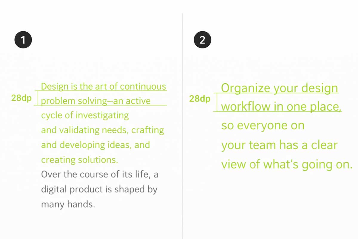
5. Paragraph Spacing
Defines how text sits within a layout
Left-aligned text is most common for English and other left-to-right languages, making long content easy to read.

Right-aligned text works best for right-to-left languages or short elements like side notes.

Centred text is ideal for short highlights such as quotes or headings, but not for long paragraphs.
6. Type alignment
Paragraph spacing controls the vertical gap between paragraphs and helps content feel organised and readable. A good rule is to keep paragraph spacing between 0.75x and 1.25x of the type size. For example, with a 20sp font and a 30dp line height, a paragraph spacing of around 28dp creates a clean and balanced layout. Proper spacing improves readability, prevents visual clutter, and enhances user experience in web and UI design.
Type size 20sp, line-height 30dp, paragraph spacing 28dp