Fashion
Fonts and Luxury Fashion Brands: The Art of Visual Prestige
In the world of luxury fashion brands, fonts are far more than typography—they are powerful symbols of heritage, exclusivity, and refined taste. Iconic fashion houses like Dior, Chanel, Gucci, and Ralph Lauren use carefully crafted luxury fonts to communicate sophistication, craftsmanship, and timeless elegance. Serif fonts often dominate high-end fashion branding, evoking tradition, authority, and premium quality, while modern sans-serif fonts reflect contemporary luxury and minimalism.
The right font enhances brand recognition, builds emotional connection, and reinforces a luxury brand’s identity across websites, logos, packaging, and digital campaigns. Clean letterforms, balanced spacing, and subtle details create a sense of confidence and exclusivity that luxury consumers expect. In the digital era, SEO-optimized luxury typography also improves readability, user experience, and brand recall online.
Ultimately, fonts define how luxury fashion brands are perceived—quietly powerful, effortlessly elegant, and unmistakably premium. Choosing the perfect font is not design, it’s strategy.
Gucci
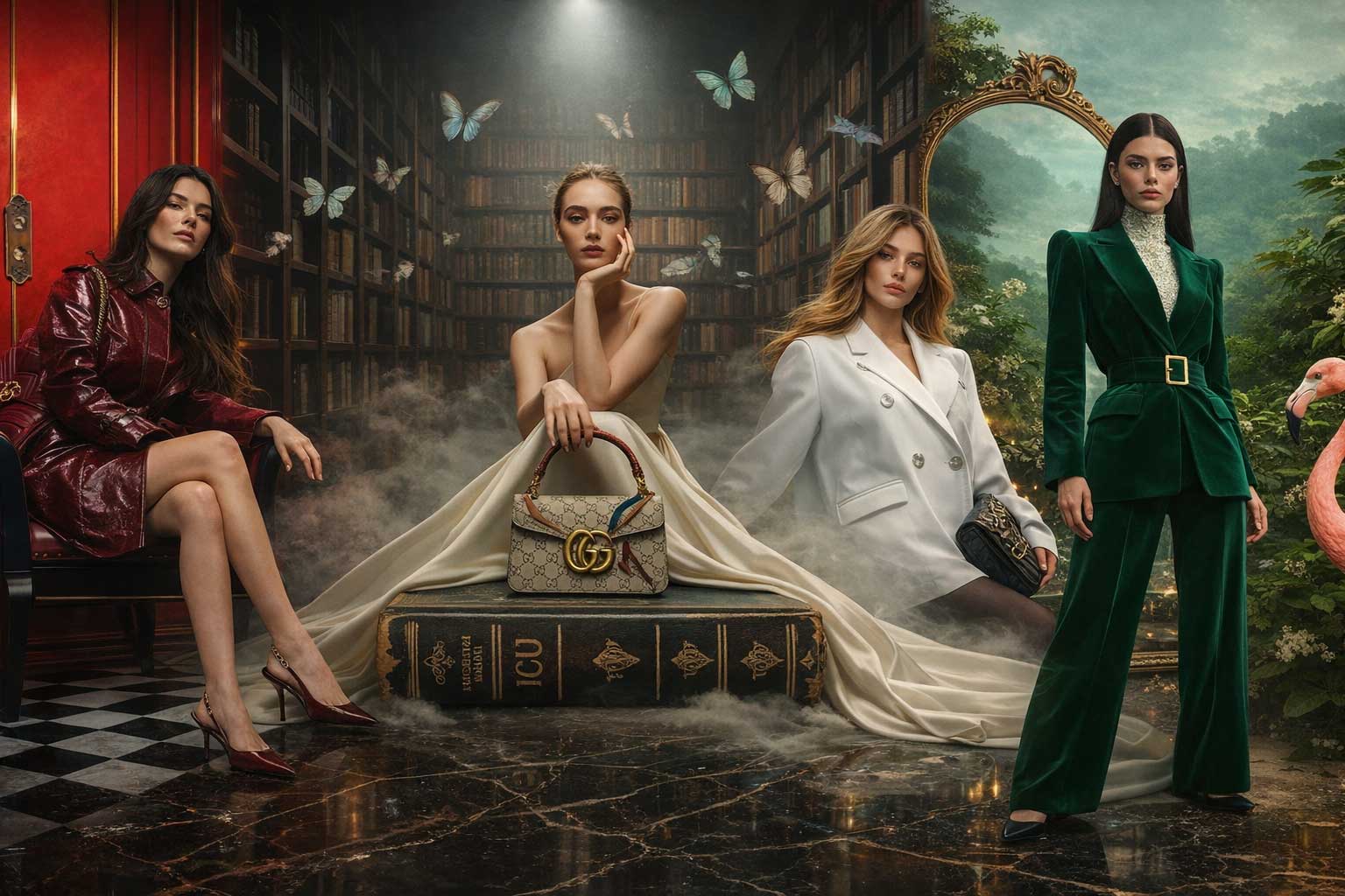
Gucci’s visual identity masterfully blends large-scale imagery with refined geometric typography to express modern luxury and timeless elegance. The use of Futura for body copy perfectly complements the Granjon logo, creating a wide, open, and effortlessly sophisticated aesthetic. Item descriptions set in Times enhance the classic luxury feel, though its delicate hairline strokes can lose clarity at smaller sizes. Overall, Gucci’s typography reinforces its status as a globally iconic luxury fashion brand.
Jimmy Choo
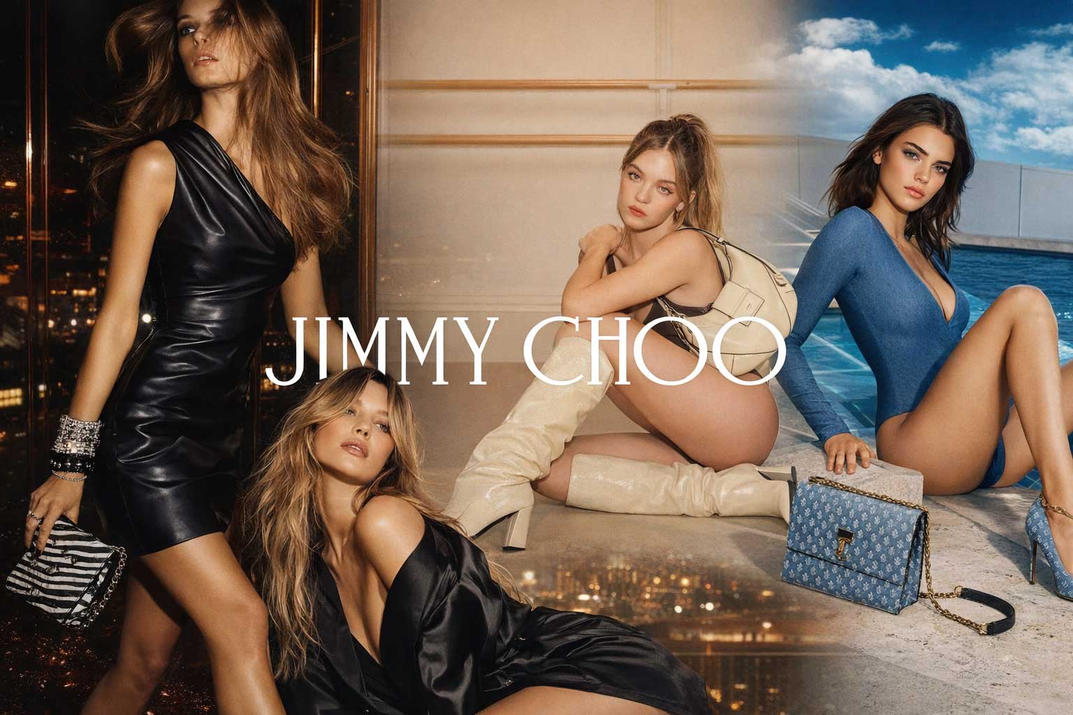
Jimmy Choo’s brand identity exemplifies refined luxury through a striking typographic contrast. The bespoke University Roman JIMMY CHOO wordmark balances narrow and wide proportions, allowing the primary typeface, Proxima Nova, to shine with clarity and confidence. Paired with simple, sophisticated photography, Proxima Nova’s clean and modern structure delivers exceptional legibility. This harmonious design language creates an elegant, classic, and understated aesthetic, reinforcing Jimmy Choo’s position as an iconic global luxury fashion brand.
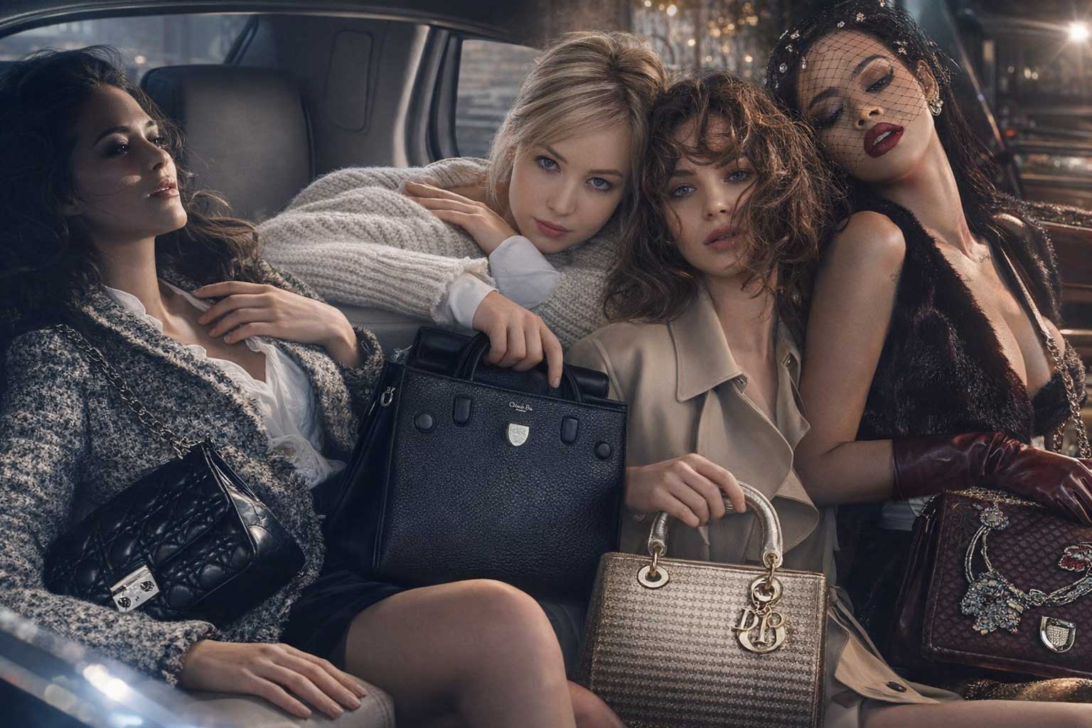
Louis Vuitton
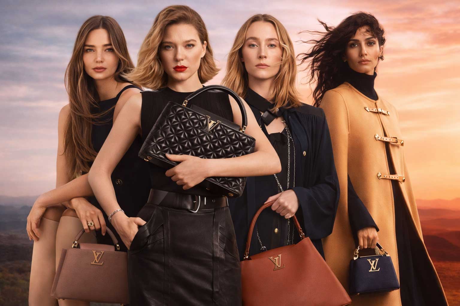
Louis Vuitton’s typography reflects heritage-driven luxury through its iconic bespoke LV monogram. Featuring thick, sculpted serifs and delicately weighted strokes inspired by the Georgia typeface, the monogram feels powerful and enduring. The use of Futura for the Louis Vuitton wordmark introduces modern clarity, creating refined contrast. While Georgia, Austin Roman, and LV Clemence appear across the website, the layered typography reinforces craftsmanship, reinforcing Louis Vuitton’s status as a timeless luxury fashion brand.
Prada
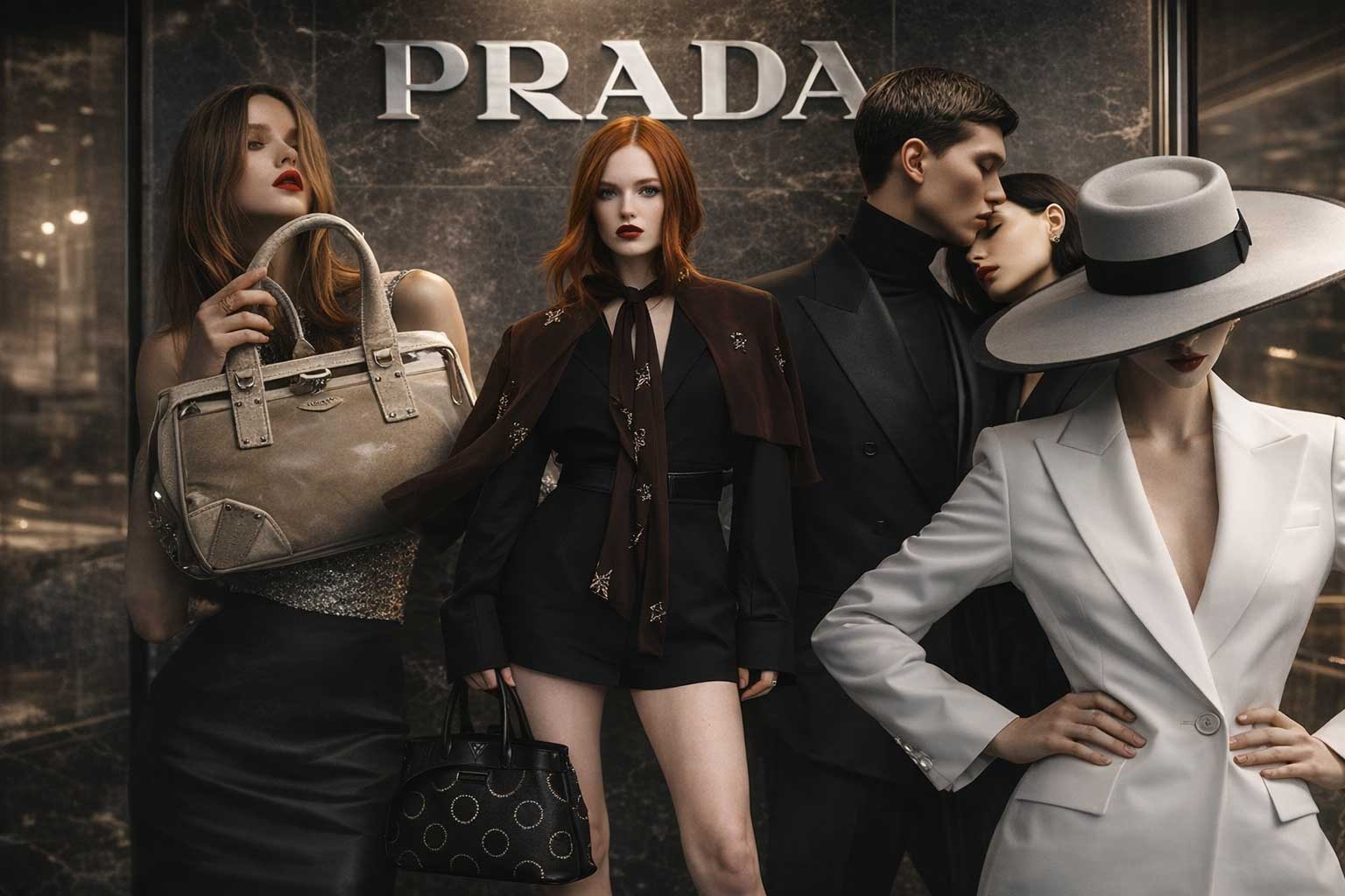
Prada’s logo features a bold, bespoke modern serif that is instantly iconic and unmistakably luxurious. On its website, expansive full-width motion imagery dominates the layout, paired with restrained typography. The main navigation appears in Universe set in all caps, while body copy relies on Source Sans Pro. Although clean and functional, this typographic approach feels understated, missing an opportunity to fully express Prada’s avant-garde fashion identity through a more distinctive luxury typography system.
Tiffany & Co
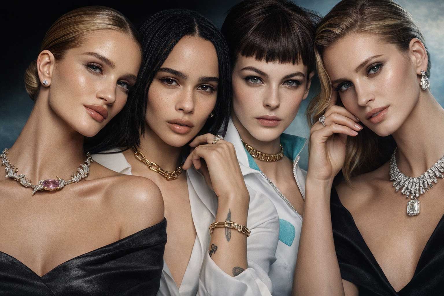
Tiffany & Co’s typography embodies refined luxury through its high-contrast serif, Sterling by Hoefler Type Foundry, used seamlessly across the logo and primary branding. Its delicate, hairline strokes convey elegance, though subtlety can fade at smaller sizes within navigation. Set in all caps for menus and captions and mixed case for body copy, the typography feels timeless and prestigious. Accents of Avenir Next and Helvetica introduce a modern balance to this iconic luxury brand.
Dior
The Dior wordmark epitomizes timeless elegance, perfectly complemented by rich, dynamic full-screen imagery that conveys style, class, and sophistication. Century Gothic supports the brand’s typography, with captions in all caps and body copy in refined upper and lowercase. The light weight of Century Gothic subtly softens the text, allowing visuals to dominate. The selective use of system font Arial ensures clarity and performance, reinforcing Dior’s polished, modern luxury digital experience.
Burberry
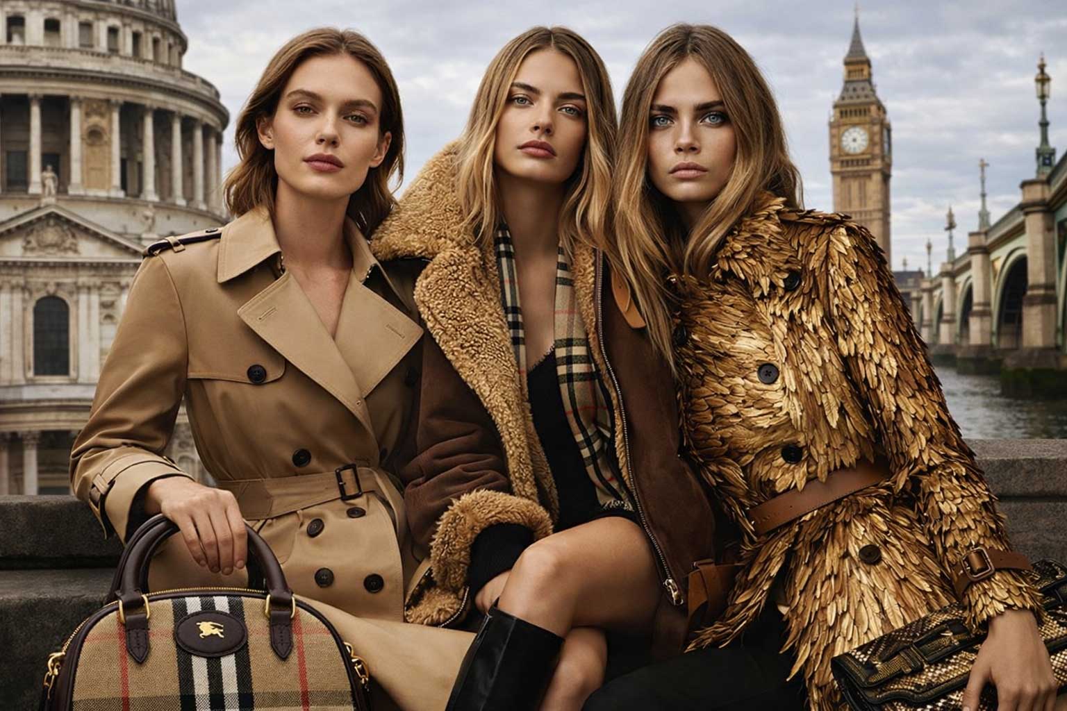
Burberry’s logo is a bespoke expanded interpretation of Bodoni, a modern serif that communicates heritage, precision, and luxury craftsmanship. Proxima Nova serves as the primary typeface for headings, captions, and body copy, delivering a clean and contemporary feel in both upper and lowercase. However, the small scale of navigation and text impacts readability. The secondary use of Times, while classic, feels understated for a leading global luxury fashion brand.
Dolce & Gabbana
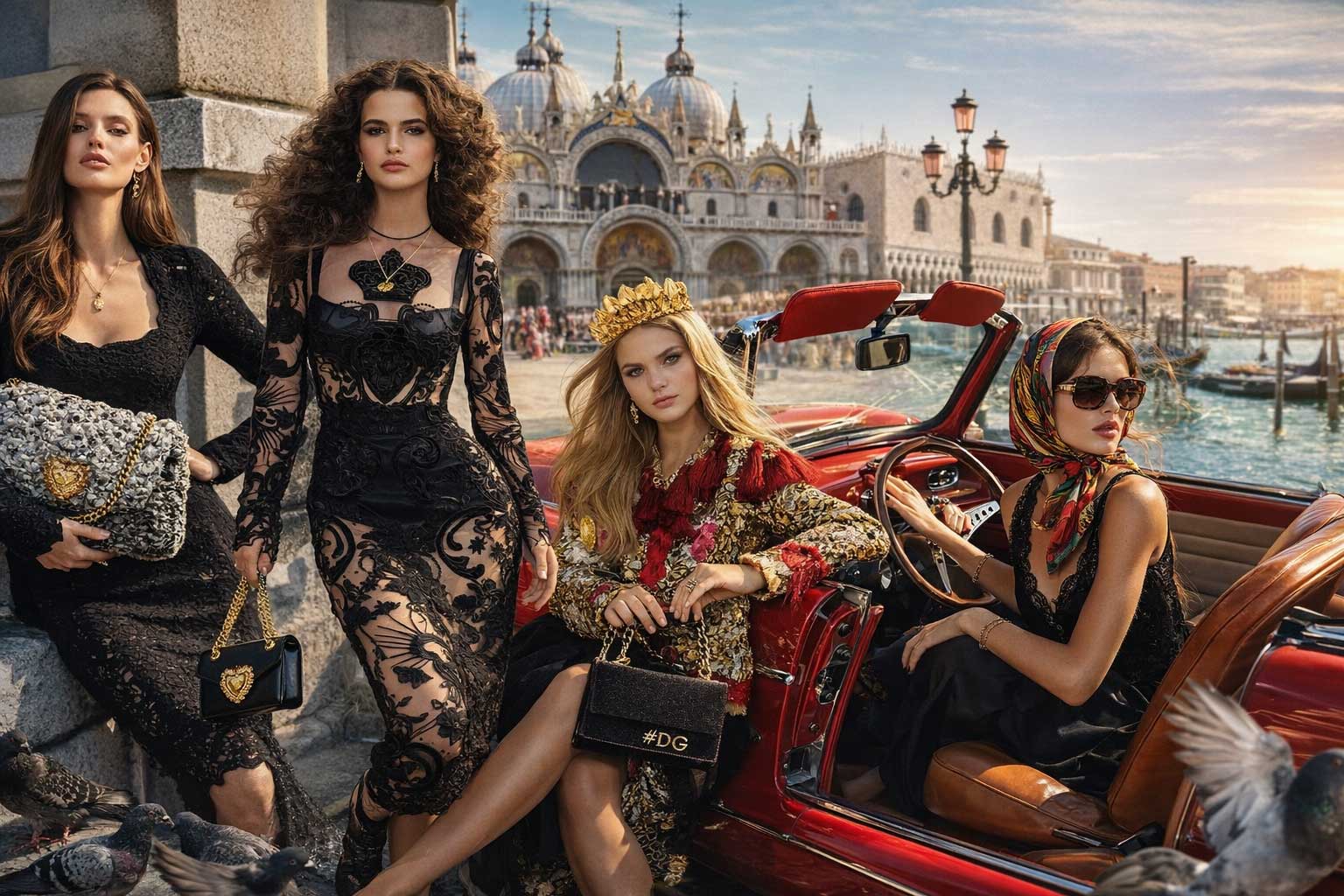
Dolce & Gabbana’s typography presents a bold yet eclectic luxury identity, blending geometric sans, transitional serif, humanist sans, chalky hand script, and even Bodoni. The iconic D&G logo in Futura Bold delivers wide, rounded, geometric strength and instant recognition. Lighter font weights in navigation and captions introduce grace and elegance. However, the lack of typographic cohesion between Futura and Avenir slightly disrupts the brand’s otherwise powerful luxury fashion presence.
Armani
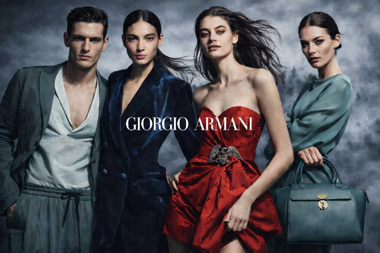
The Armani Didot logo, though delicately hair lined at times, remains a definitive symbol of luxury, couture, and refined style. This classic serif embodies timeless elegance, while Montserrat adds balance as a robust, open, and harmonious geometric sans. Paired with dark, masculine tones and powerful imagery, Armani’s typography expresses confidence and sophistication. The fusion of modern precision and classic refinement reinforces Armani’s iconic status within the global luxury fashion industry.
Manolo Blahnik
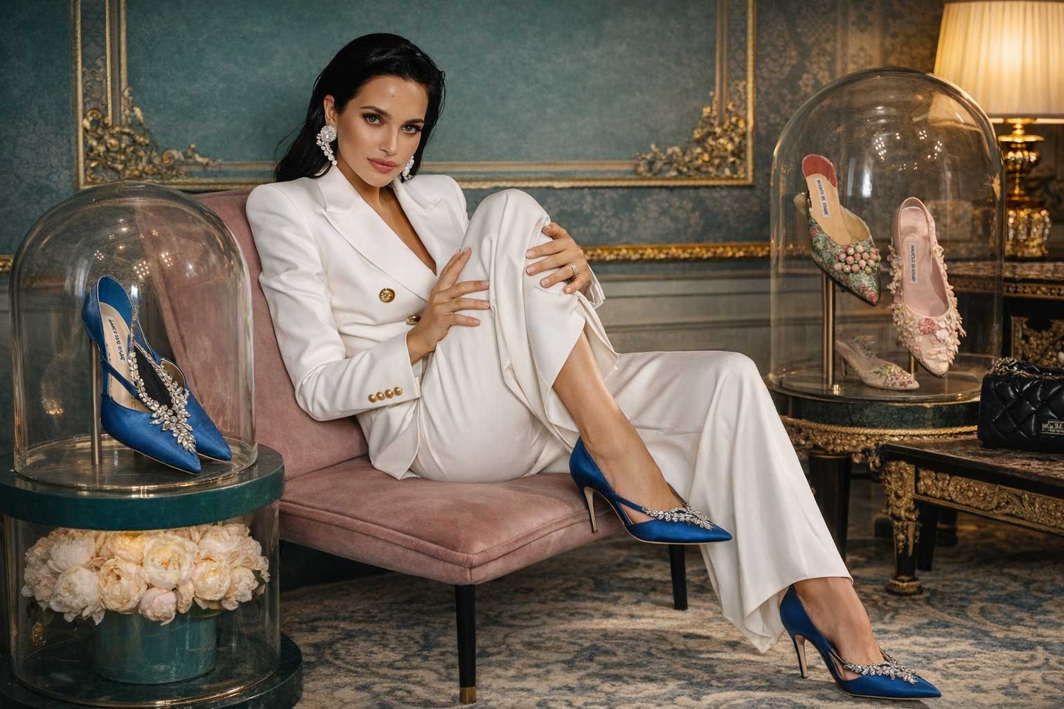
Manolo Blahnik’s typography relies solely on Arial, creating a consistent and highly functional digital experience. While Arial’s neo-grotesque structure ensures excellent screen readability, its universal availability feels understated for a high-end luxury fashion brand. Set against a pristine white background with generous spacing, the all-caps headings and navigation achieve a refined, sophisticated tone. However, the absence of a bespoke or premium typeface represents a missed opportunity for stronger brand differentiation in luxury fashion branding.