Beauty
Lancôme
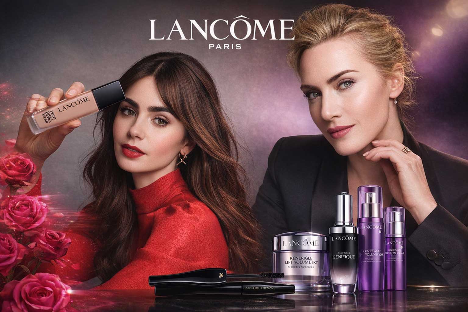
Lancôme’s typography embraces a high-contrast luxury aesthetic, led by an elegant Garamond with refined hairline strokes that signal exceptional quality and heritage. Garamond appears in all caps for the navigation, while upper and lowercase styling elevates large captions with sophistication. Gotham supports the body copy, adding modern clarity and balance. Dominant black tones heighten visual contrast, while restrained use of colour reinforces Lancôme’s timeless, premium positioning in the global luxury beauty and fashion space.
Clinique
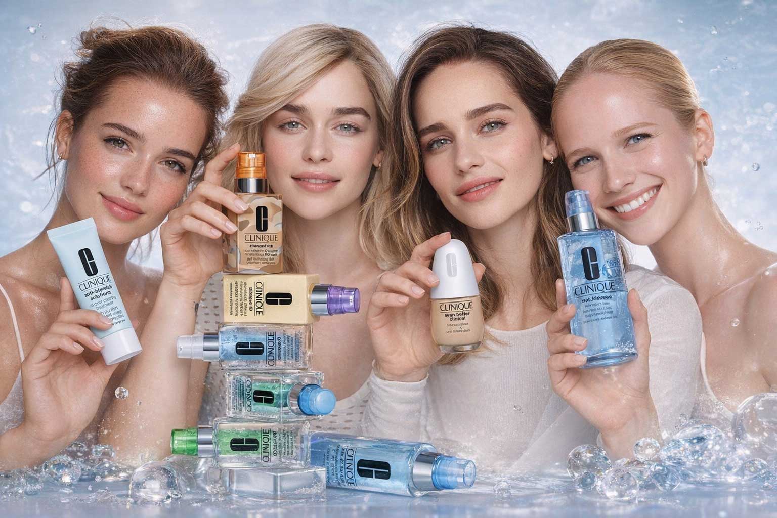
Clinique’s typography delivers a distinctive luxury identity through its unconventional logo font, Jorvik Informal, a softly wobbled serif that feels both refined and unique. Paired with the timeless clarity of Helvetica, generous spacing, and soft pastel tones, the brand achieves a clean, modern, and fresh aesthetic. This minimalist yet thoughtful typographic approach sets Clinique apart in the luxury cosmetics industry, proving that simplicity, when executed precisely, can be powerfully effective.
Bobbi Brown
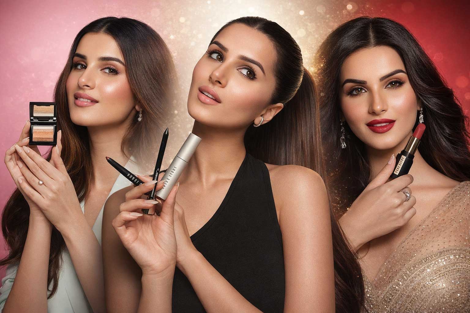
Bobbi Brown’s typography stands apart in the luxury beauty landscape with its logo set in Univers Ultra Condensed, introducing uniquely narrow proportions. Generous white space paired with black typography and sharp borders creates a stark, editorial tone. Decorative hand-script accents add contrast but lack refinement, appearing visually heavy. Brandon Text, a rounded geometric sans, softens the overall look, though smaller sizes reduce clarity. This mix delivers a bold yet minimalist luxury aesthetic.
Clarins
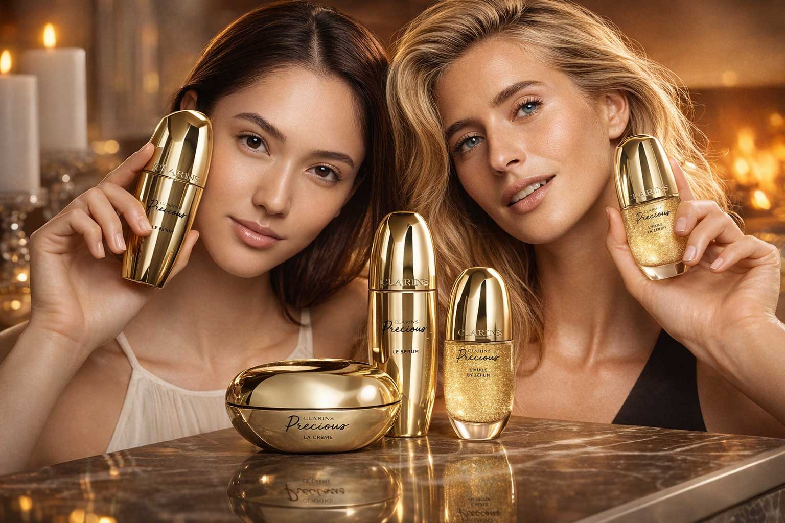
Clarins’ typography expresses refined luxury through a primary contrasted serif reminiscent of Baskerville, an elegant choice perfectly suited to premium beauty and skincare branding. Used prominently in large captions, the Clarins typeface conveys sophistication and trust. Generous white space enhances the sense of purity and exclusivity, while Gotham SmartScreen supports body copy with exceptional clarity and readability. This harmonious blend of classic serif elegance and modern sans-serif precision reinforces Clarins’ position as a leading luxury beauty brand.
Estēe Lauder
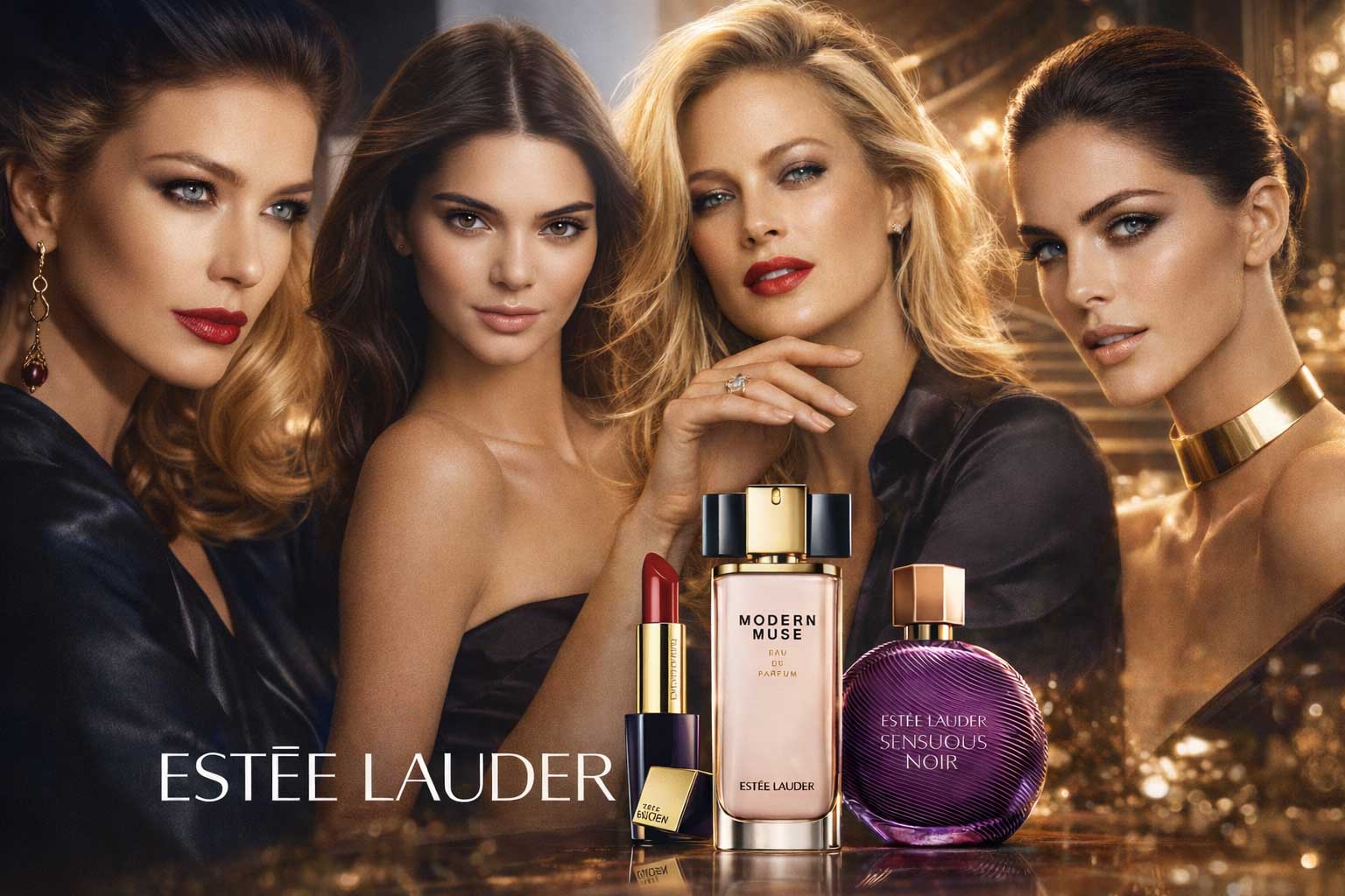
Optima is a refined contrasted sans-serif typeface celebrated for its elegance, clarity, and timeless design. With classic proportions, a tall x-height, and subtle detailing, it offers exceptional legibility with understated sophistication. Estée Lauder elevates Optima by using lighter weights, enhancing finesse and femininity. Paired with expansive luxury imagery and a signature navy-blue palette, the typography conveys a formal, serious, and highly sophisticated aesthetic, reinforcing Estée Lauder’s prestige within the global luxury beauty industry.
YSL
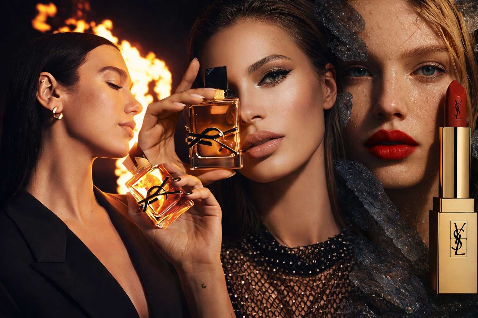
This brand marks a bold departure from the overused Gotham by adopting ITC Avant Garde Gothic Condensed as its primary typeface. Narrow and tightly closed, it challenges legibility and stands apart within the luxury beauty sector. The standard ITC Avant Garde Gothic, used at large, poster-scale sizes, delivers a strong and dominant presence. While visually powerful, this geometric, mono-linear typography feels less refined, softening the brand’s overall sense of finesse and elegance.
Tom Ford
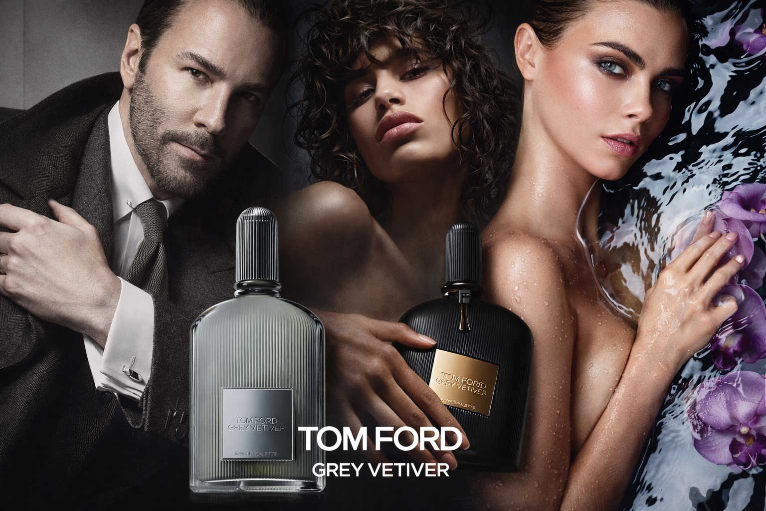
Tom Ford’s website typography is unapologetically bold, defined by an all-caps approach and a striking black-and-white colour palette. With no lowercase typography in sight, the brand projects confidence, power, and modern luxury. This strong visual language creates a sense of swagger and high-fashion attitude, appealing to younger, style-driven audiences. Highly masculine and dominant, Tom Ford’s typographic system reinforces its reputation as a daring, contemporary luxury fashion brand with unmistakable authority.
Chanel
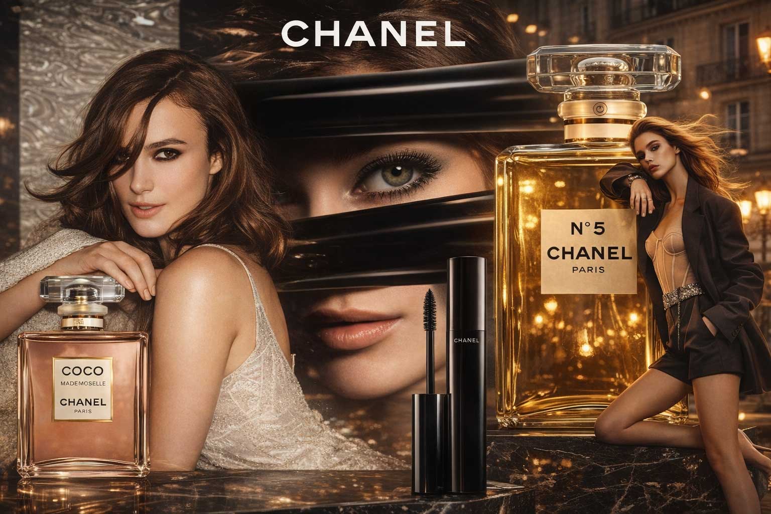
Chanel’s typography is defined by a strong, bold geometric sans logo set in all caps, embodying timeless elegance and refined luxury. Using a renamed version of Gotham, the brand maintains unwavering consistency, with bold, uppercase typography dominating headings and navigation. Subtle body copy appears in Helvetica for clarity. The distinction between masculine and feminine collections relies purely on colour and imagery, reinforcing Chanel’s confident, minimalist approach to luxury fashion branding and iconic visual identity.
Shiseido
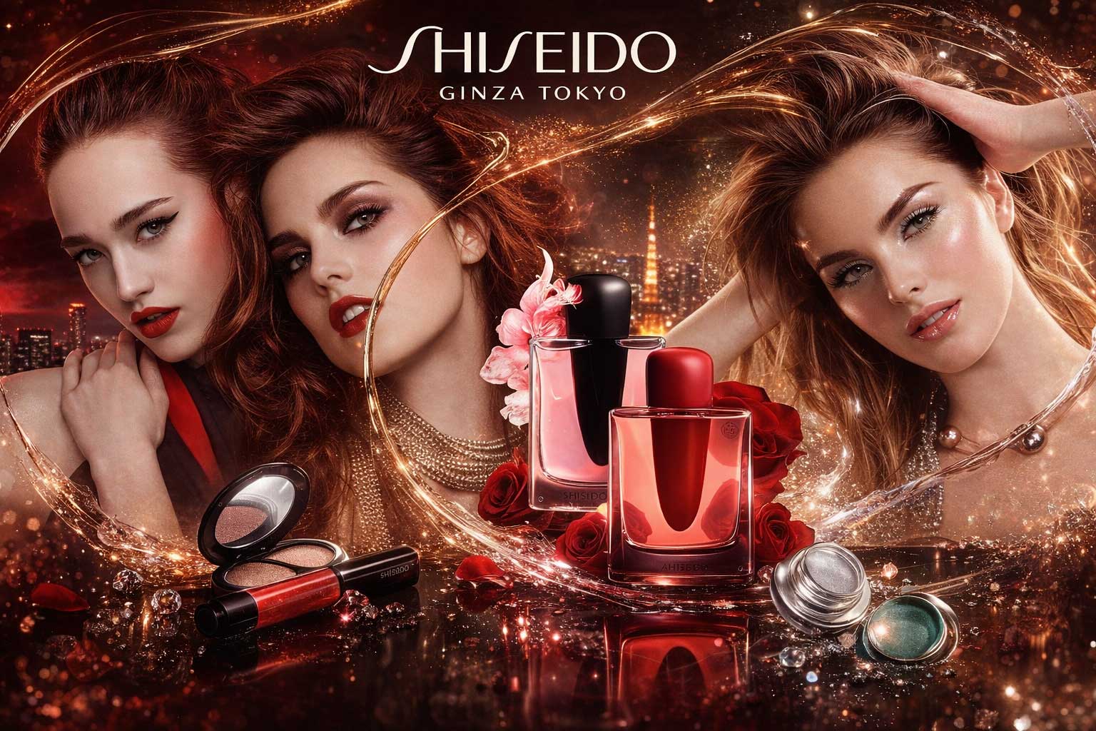
Shiseido’s typography reflects modern luxury through Reader Bold, a Gotham-inspired typeface set in all caps for navigation, reinforced by a striking black-on-white aesthetic. The bespoke Shiseido2013 font, reminiscent of Optima, is used for body copy and fine details, featuring high contrast, a generous x-height, and open counters. While the typography feels premium and refined, inconsistent text alignment and spacing slightly disrupt the otherwise elegant, high-end digital brand experience.
Givenchy
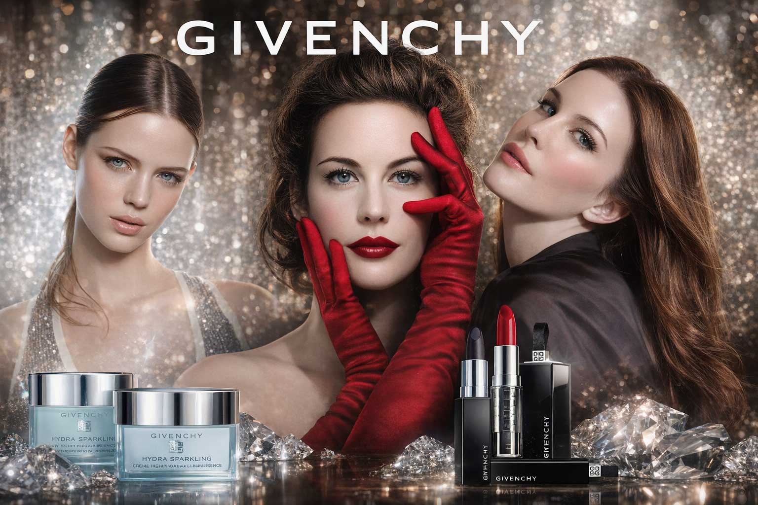
Givenchy’s typography reflects its chic French luxury heritage through a strong emphasis on imagery and refined all-caps typography. Captions and select text are set in Sackers Gothic Light, a wide, mono-linear sans with elegantly stretched proportions that convey modern sophistication. Aperçu complements this with a sleek, narrow grotesque contrast, balancing the iconic squared Givenchy emblem. This restrained, uppercase typographic system reinforces Givenchy’s high-fashion identity, delivering a clean, creative, and unmistakably luxurious digital presence.